My job: UI designer
Team: Yiran Park, Bob Frady (The CEO of Hazardhub)
Client: Hazardhub
Tools: Sketch, InVision
Schedule: Dec 2019 (3 days)
Deliverables: Wireframes, wireflow, UI design, style guide, interactive prototype
Team: Yiran Park, Bob Frady (The CEO of Hazardhub)
Client: Hazardhub
Tools: Sketch, InVision
Schedule: Dec 2019 (3 days)
Deliverables: Wireframes, wireflow, UI design, style guide, interactive prototype
INTRODUCTION
Freehomerisk.com is a service of HazardHub, an insurtech startup that builds the geospatial database for the entire United States and provides comprehensive property risk assessment. It has a network of innovative business partners in the tech industry, including IBM, SpatialKey, and MarketScout.
After being recommended as a UX designer to the client by my agency, I was asked to build a new UI for an existing website in 3 days. My task was to understand the users' pain points and find any other usability issues within the website. Then, I worked extensively on secondary research and UI design to solve those problems.
Day 1
THE PROBLEM
The client addressed following pain points during the initial discussion.
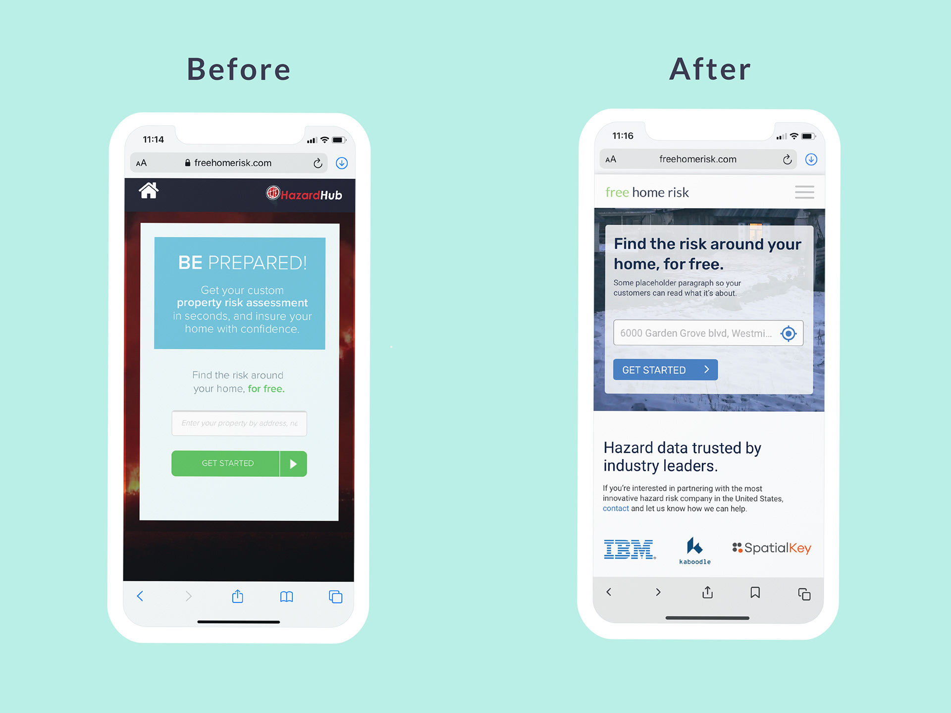
• Current website is not optimized for viewing on mobiles devices
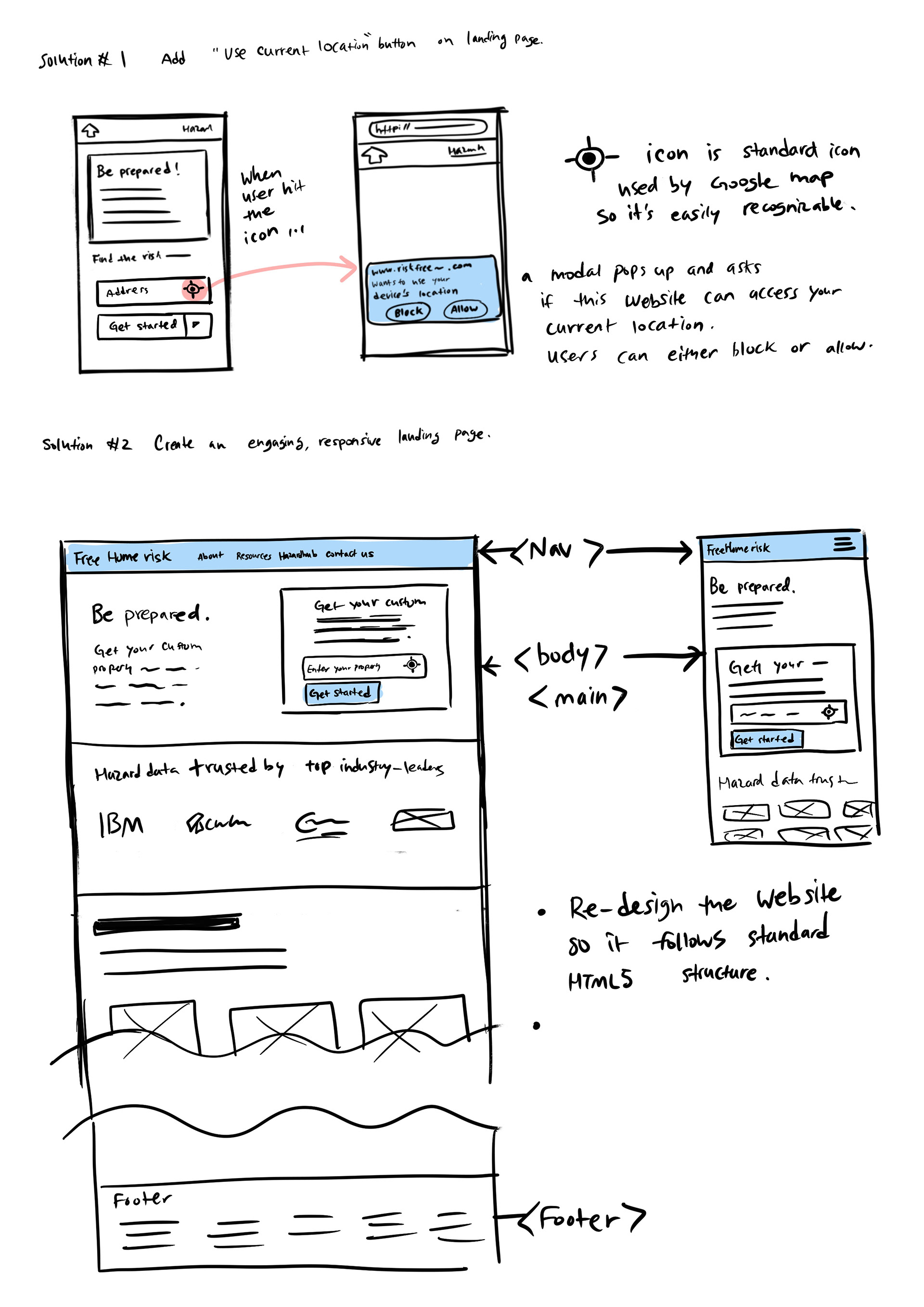
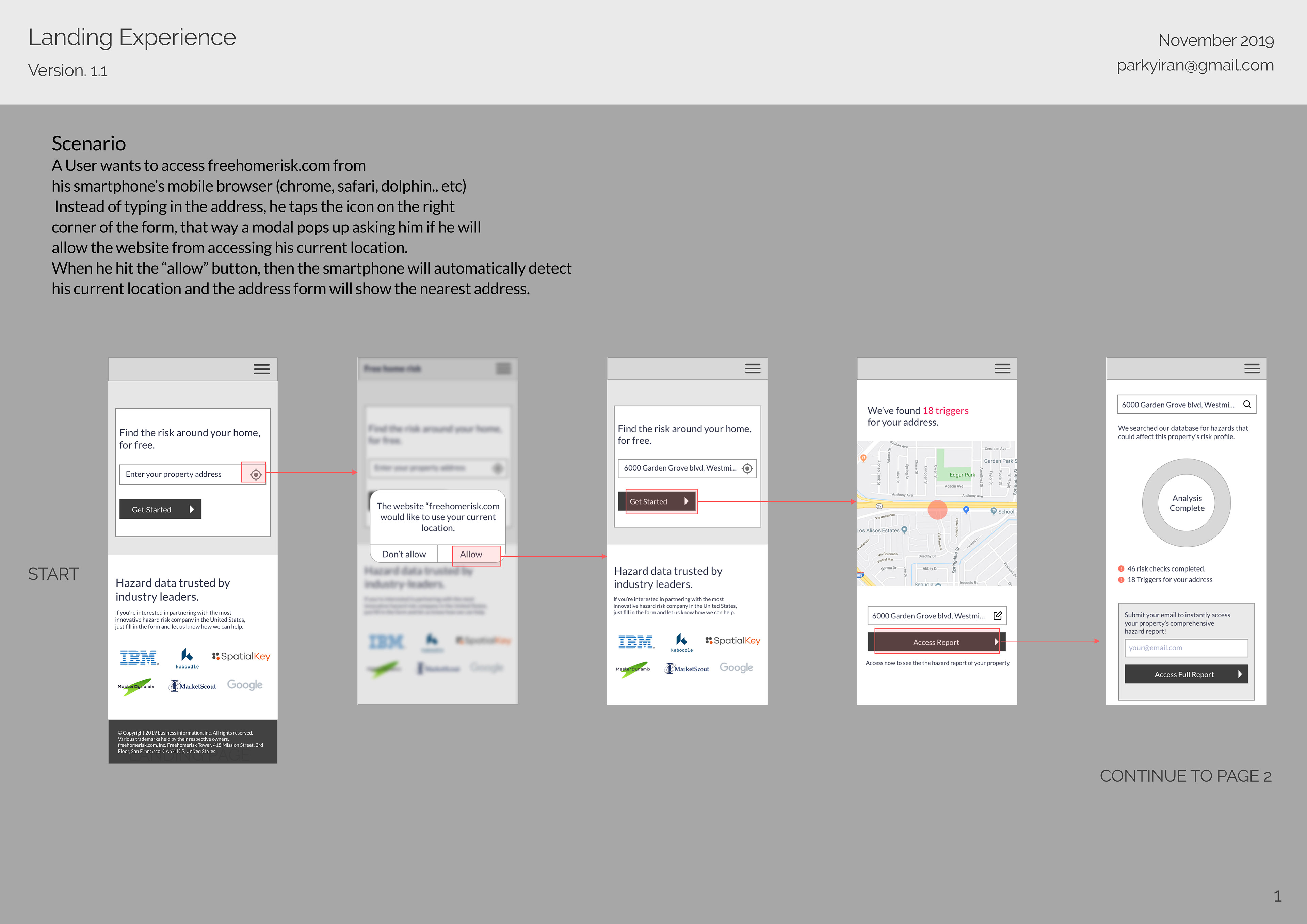
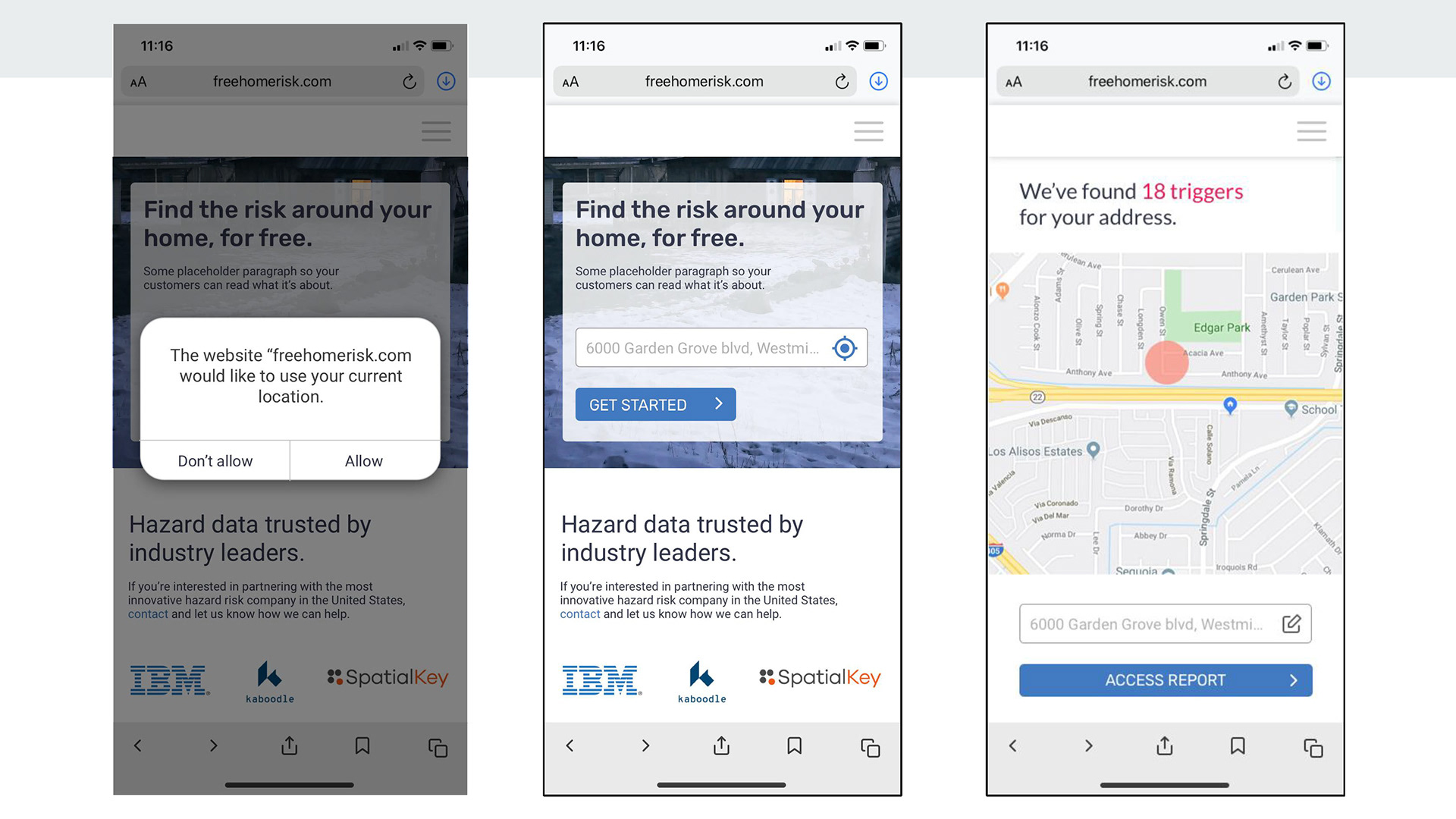
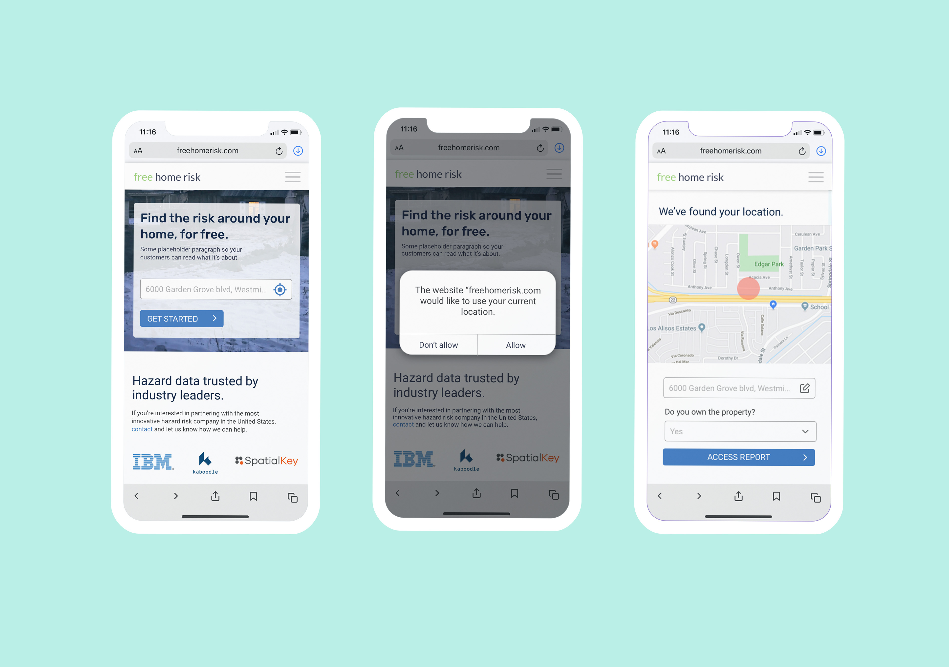
• Allow customers to geolocate their current location, so they don't have to enter an address manually
To further identify more usability problems that have not yet been addressed, I conducted a heuristic evaluation and reviewed psychology principles.
• Current website is not optimized for viewing on mobiles devices
• Allow customers to geolocate their current location, so they don't have to enter an address manually
To further identify more usability problems that have not yet been addressed, I conducted a heuristic evaluation and reviewed psychology principles.
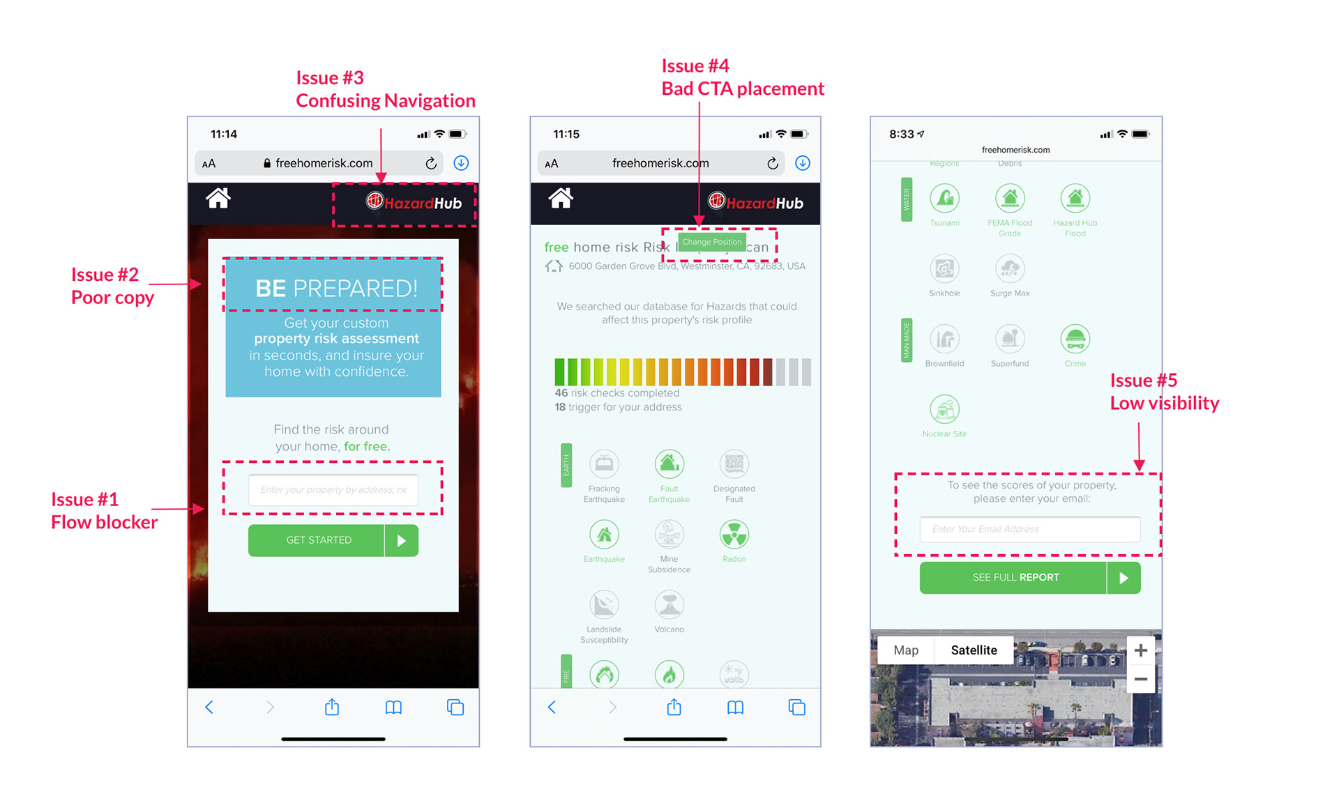
ISSUE #1 When the user wants to access the information of the property, they have to type in the address manually (which my client has already addressed in our initial discussion.)
ISSUE #2 The copy starting with "Be prepared!" sounded a bit aggressive. Also, the website has an accessibility issue with a low contrast between the background and the copy.
ISSUE #3 The navigation bar has two conflicting icons. The top-right icon looks like it is the logo for the website but it's actually a logo for an external website.
ISSUE #4 The "Change position" CTA button does not convey clear purpose. I got navigated back to the landing page when I clicked it. The CTA button appeared on a random spot when viewed on a mobile device.
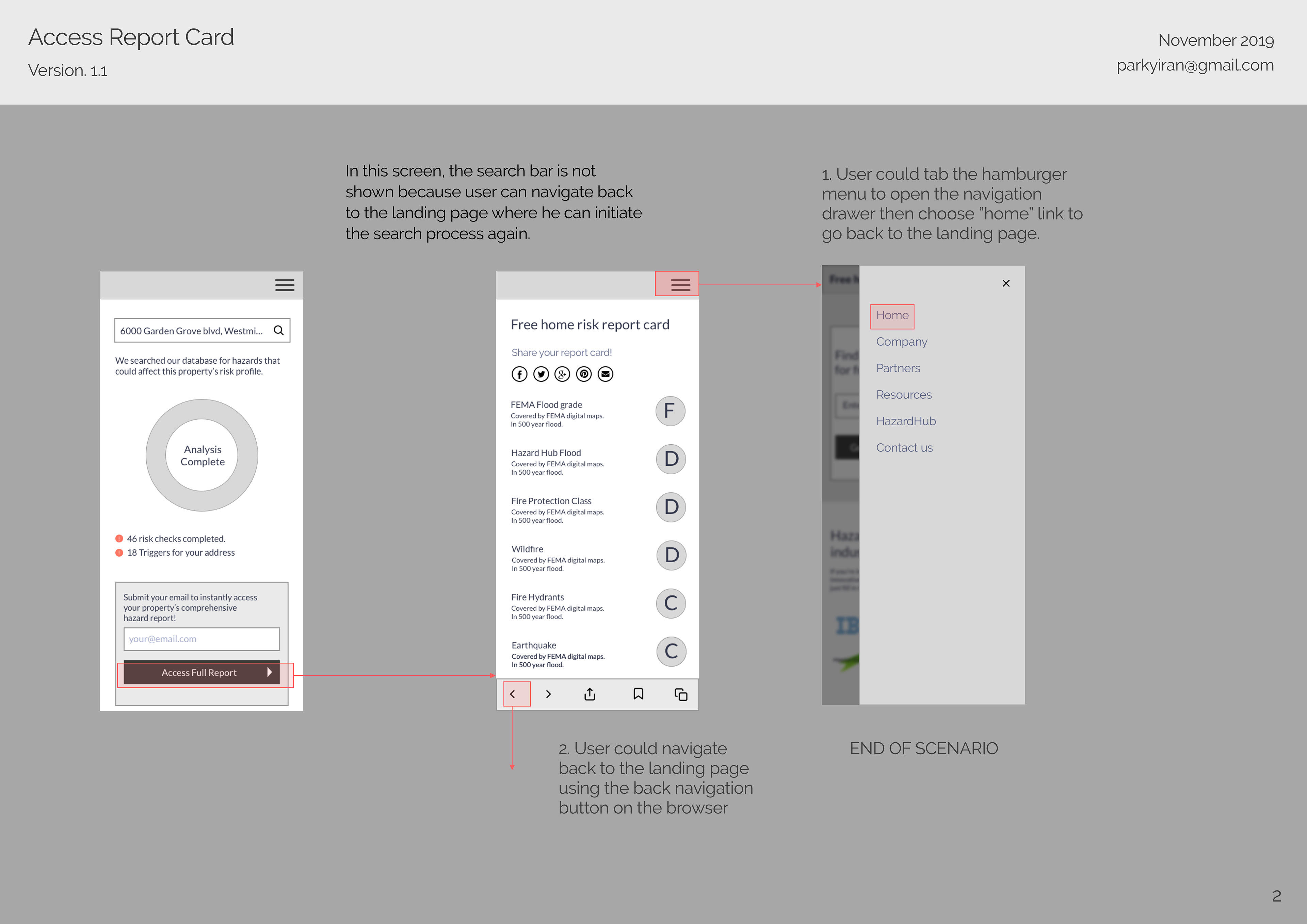
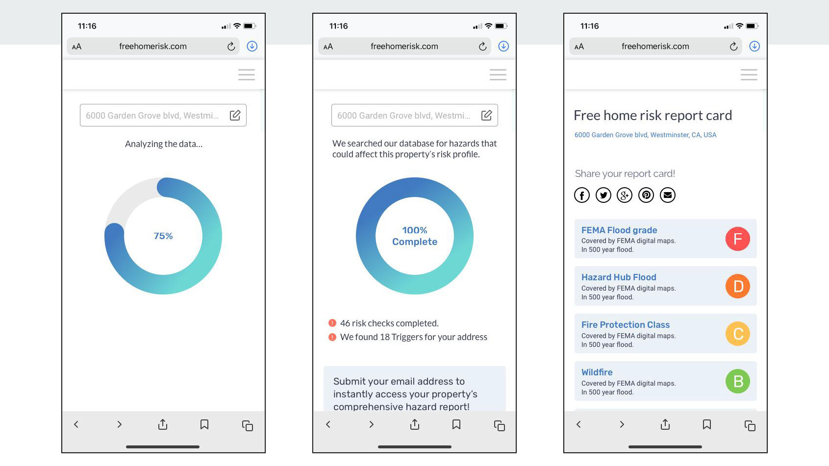
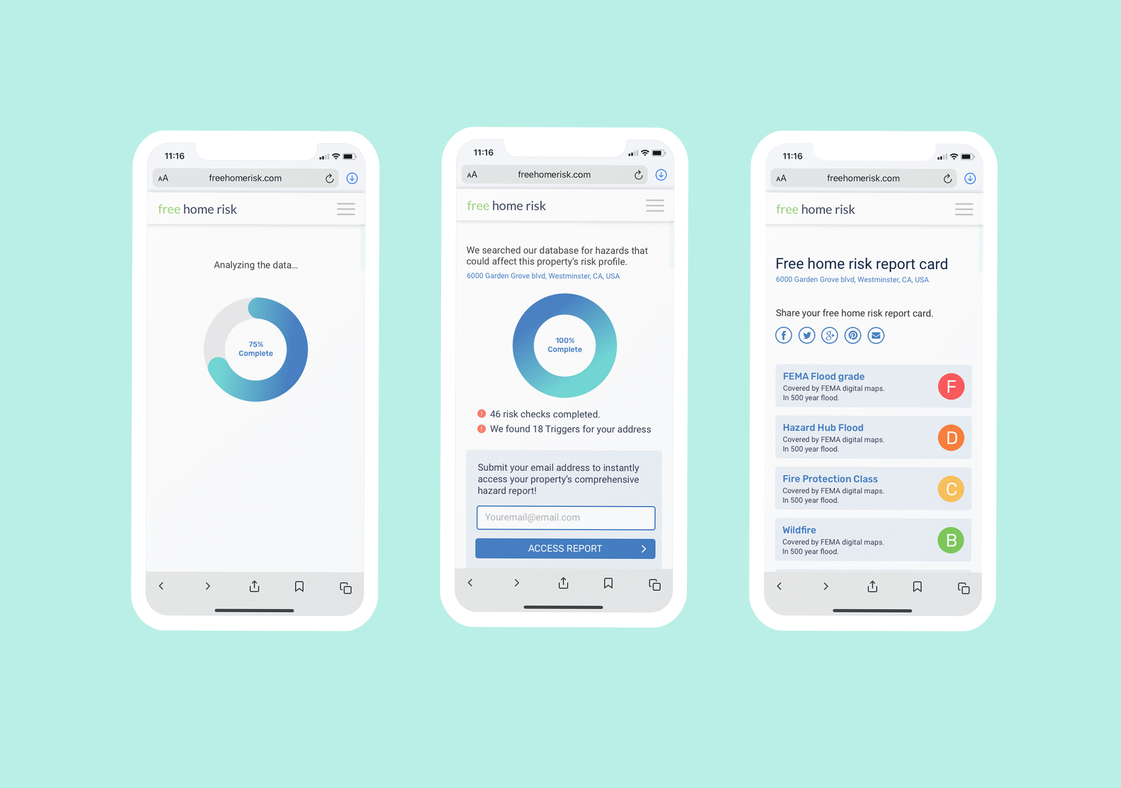
ISSUE #5 When a user wants to access the comprehensive report by submitting their email, they have to scroll down to the bottom to reach the email submission form.
ISSUE #2 The copy starting with "Be prepared!" sounded a bit aggressive. Also, the website has an accessibility issue with a low contrast between the background and the copy.
ISSUE #3 The navigation bar has two conflicting icons. The top-right icon looks like it is the logo for the website but it's actually a logo for an external website.
ISSUE #4 The "Change position" CTA button does not convey clear purpose. I got navigated back to the landing page when I clicked it. The CTA button appeared on a random spot when viewed on a mobile device.
ISSUE #5 When a user wants to access the comprehensive report by submitting their email, they have to scroll down to the bottom to reach the email submission form.
User Profiles
The consultation with my client made it evident how different users would use the app differently. To cater to this, I categorized them into two user profiles based on their goals and tasks.
1. Insurance agents
Help clients choose the best property insurance.
Uses iPhone, LinkedIn, Facebook, Outlook, Office suite.
Uses iPhone, LinkedIn, Facebook, Outlook, Office suite.
Tasks performed:
• Communicate with the client by phone or email, or even in-person by visiting the property
• showing the hazard risk assessment to the client
• Ensure the clients they are purchasing the best option
• Communicate with the client by phone or email, or even in-person by visiting the property
• showing the hazard risk assessment to the client
• Ensure the clients they are purchasing the best option
2. Clients
The decision maker. Homeowner, commercial property owner, manager, or investor. want to learn the hazard risks for the property they own or want to purchase in the future.
Uses iPhone, Facebook messenger, Instagram, Gmail.
Uses iPhone, Facebook messenger, Instagram, Gmail.
Tasks performed:
• Tell the insurance agent about their needs and concerns
• Learn the risks about their property and make the decision
• Tell the insurance agent about their needs and concerns
• Learn the risks about their property and make the decision
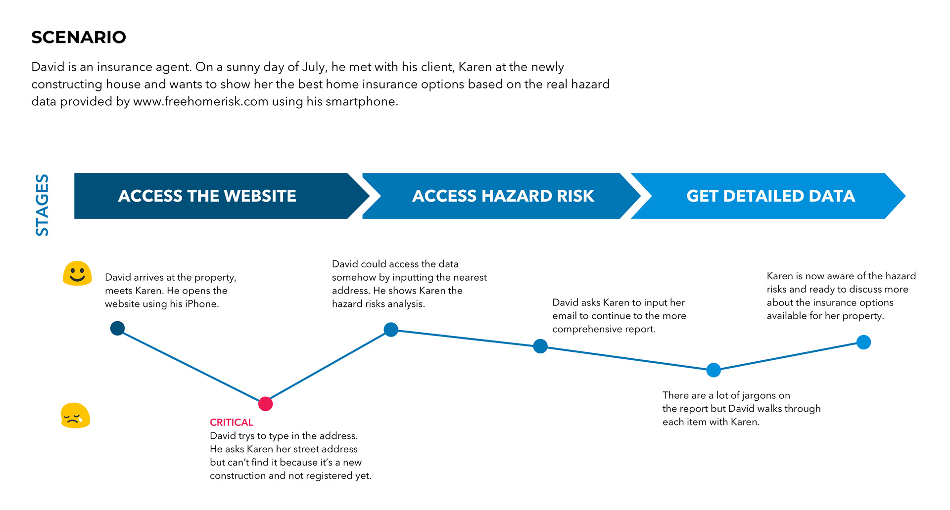
The critical problem, as shown in the scenario above, was happening because there was a gap between the database structure and its front-end design. In theory, the hazard risk data by Freehomerisk.com are available for any geographic location because it is organized based on the coordinates, latitude and longitude, not mailing addresses. Thus, users should be able to access the data for any geographic locations as long as the coordinates are given.
However, the mailing addresses being the only search option, users were having a problem accessing the data for properties without an address such as an empty lot and construction site.
THE SOLUTION
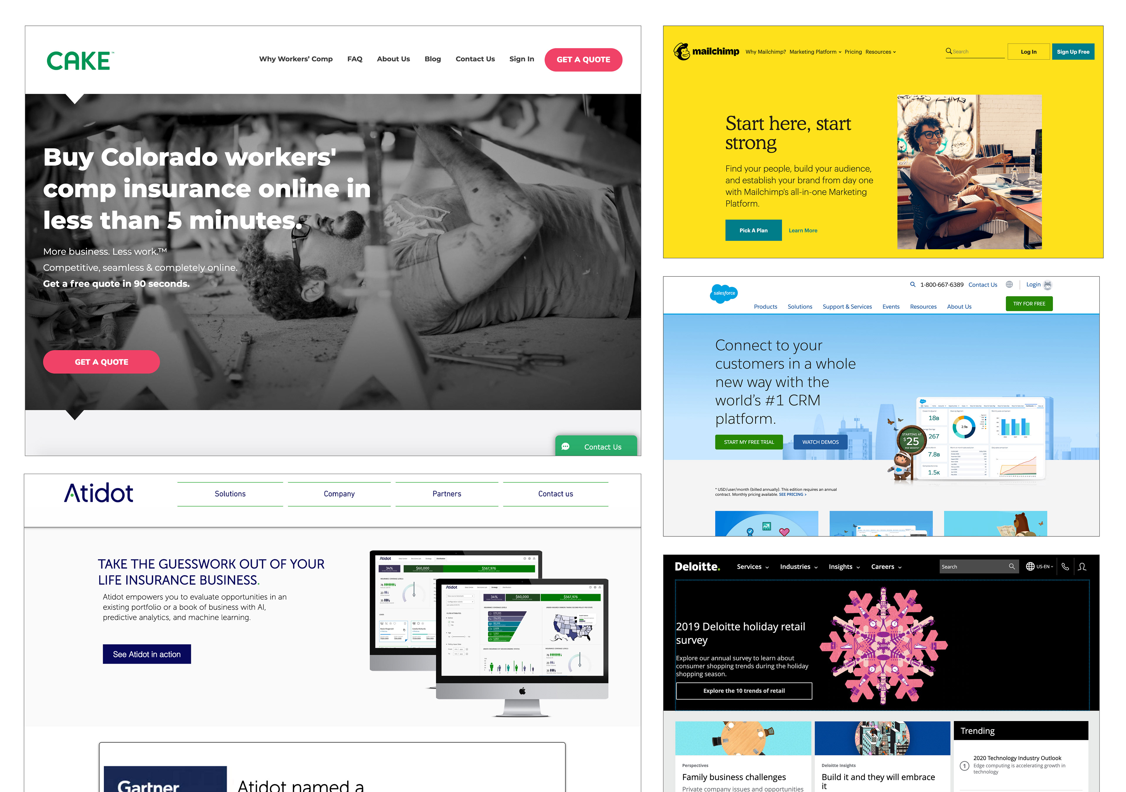
After I have analyzed the pain points and design problems, I have looked at other websites to get some inspirations. Inspirations included insurtech companies as well as other corporate websites.
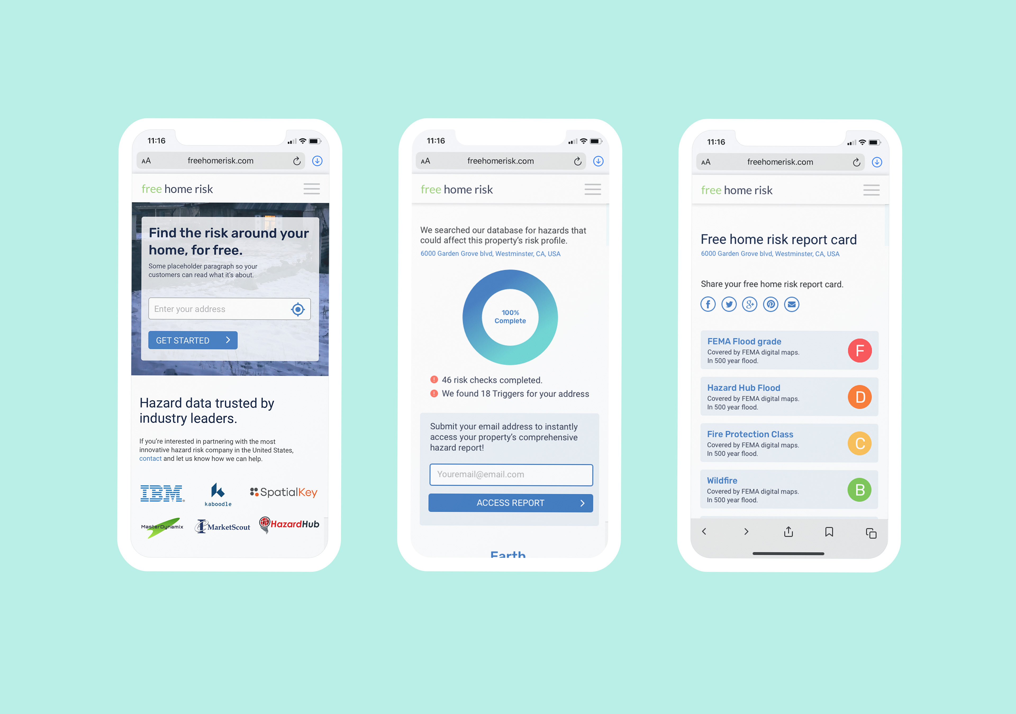
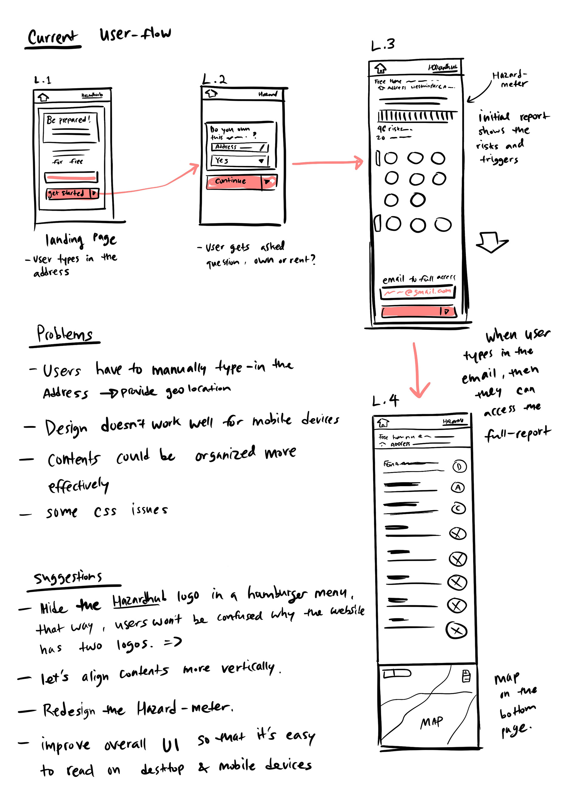
Then I worked on the wireframes and wireflows.. At the end of Day 1, I shared my sketches and wireframes for my client's review, and an interactive prototype so he can test it.
Day 2
At first, I designed the landing page and reorganized the information architecture so the site visitors can learn more about the company. I added extra stuff like About us page, blog, resources in the site navigation thinking it would add value to the company's branding. However, after talking to my client I learned that it necessarily wasn't the case.
"I don't want the website to show too much corporate identity. So, the additions like blog articles, resources and partners are not needed. In fact, we might need to white-label the whole website in the future."
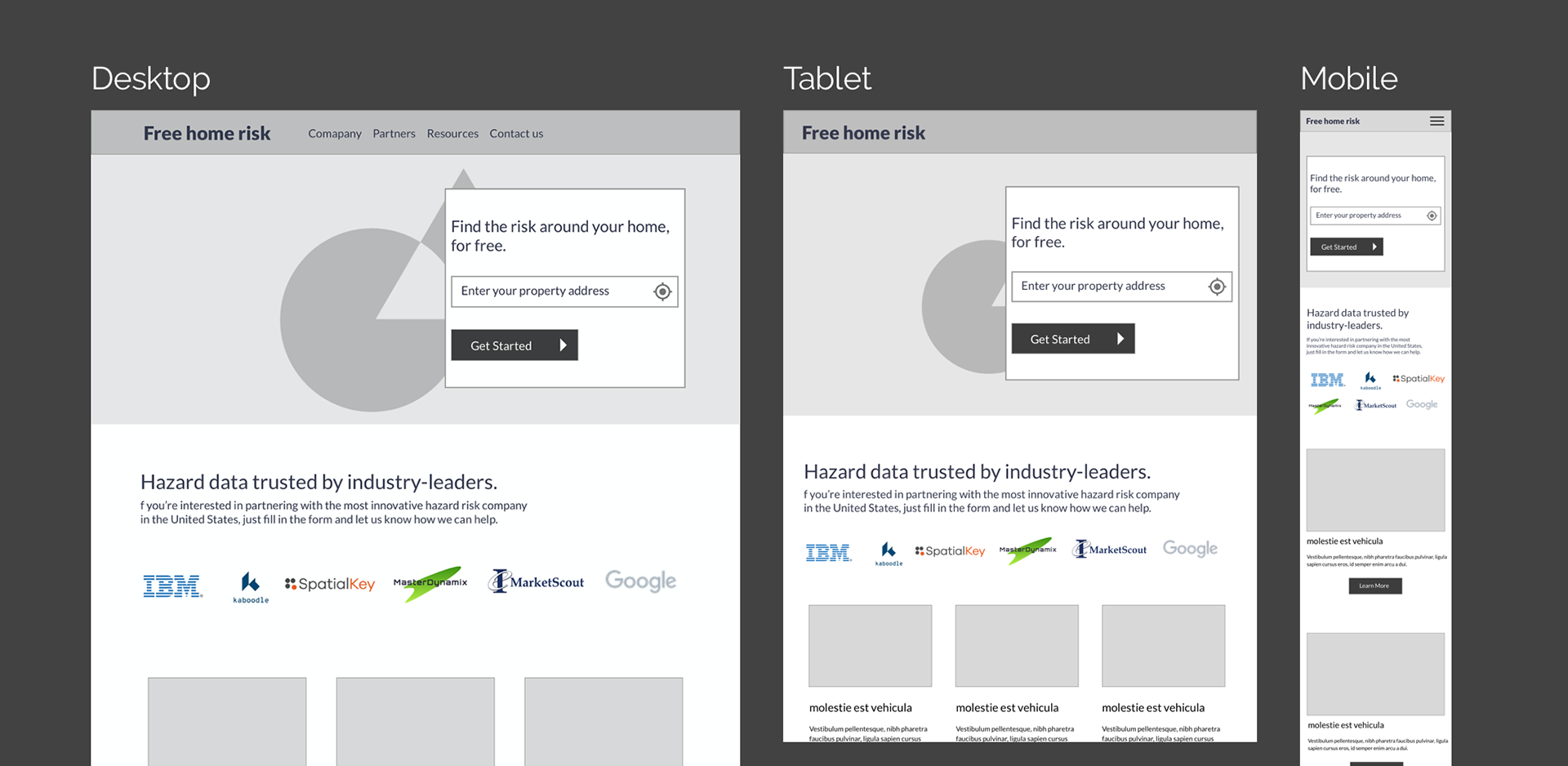
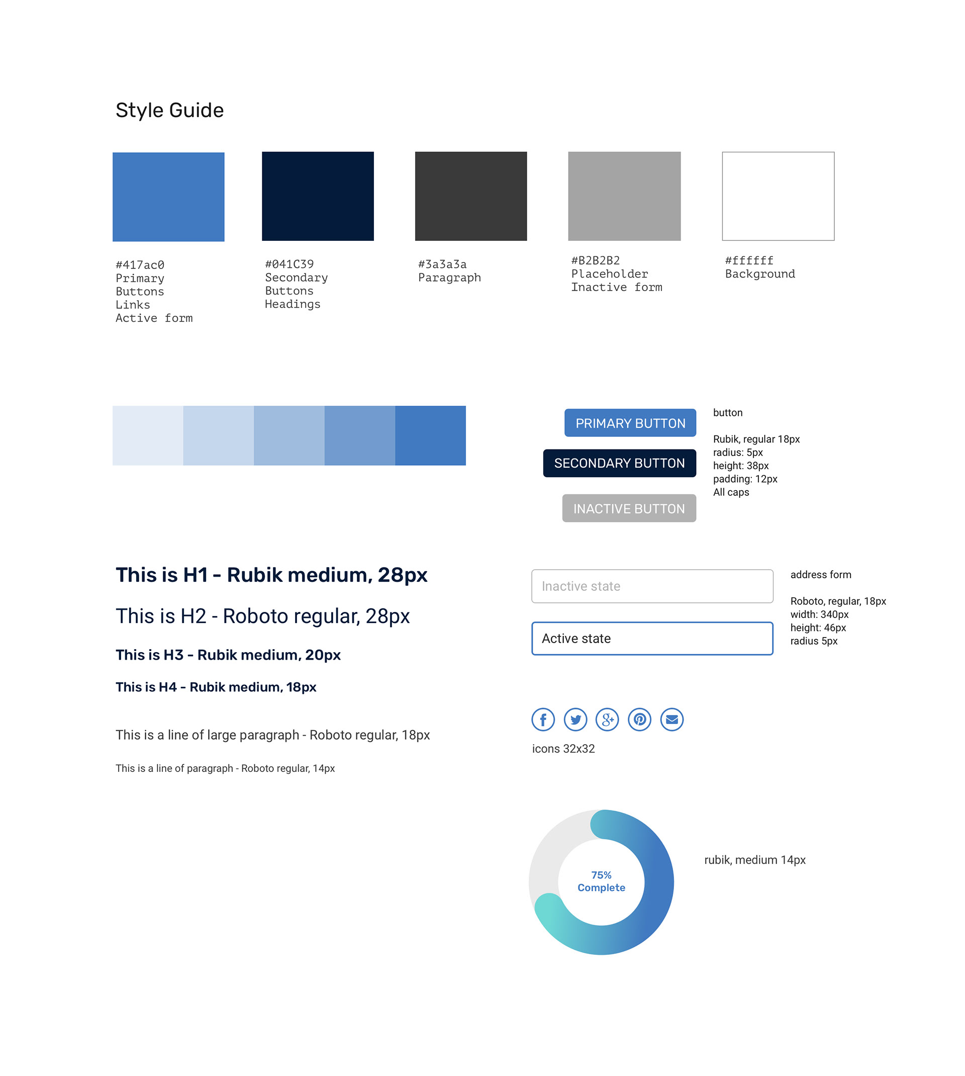
After receiving feedbacks, I reorganized the sitemap and made changes to the wireframes to reflect my client's needs. Then, I moved onto creating the hi-fidelity prototype and the style guide. The previous design used light blue and light green as its color scheme. I liked the color choices there, but accessibility problem was too critical. I decided to use white and dark blue to increase the color contrast.
"I don't want the website to show too much corporate identity. So, the additions like blog articles, resources and partners are not needed. In fact, we might need to white-label the whole website in the future."
After receiving feedbacks, I reorganized the sitemap and made changes to the wireframes to reflect my client's needs. Then, I moved onto creating the hi-fidelity prototype and the style guide. The previous design used light blue and light green as its color scheme. I liked the color choices there, but accessibility problem was too critical. I decided to use white and dark blue to increase the color contrast.
Day 3
I made some minor adjustments based on his feedback which took me a couple hours to work on. I got a confirmation that everything looks good so I uploaded the final deliverables to Dropbox. And my job was done, within 13.5 hours of work time!

CONCLUSION
I was the only member of my team, but my client, the CEO of Hazardhub, reviewed the UI designs, and tested the interactive prototype each day and provided helpful feedback. I worked remotely but we didn't have issue with communication.
I mostly relied on the desk research and heuristic analysis to identify the problems due to time constraints and limited resources. Thus, I adopted a design-sprint approach to get initial direction in the project to finish the redesigning in an accelerated timeframe.
If I could conduct more user research in the future, I would probably include Google analytics, A/B testings and user testings with the target user groups, the insurance agents and homebuyers, to validate my assumptions and see if the updated design really helped boost the company's profit.