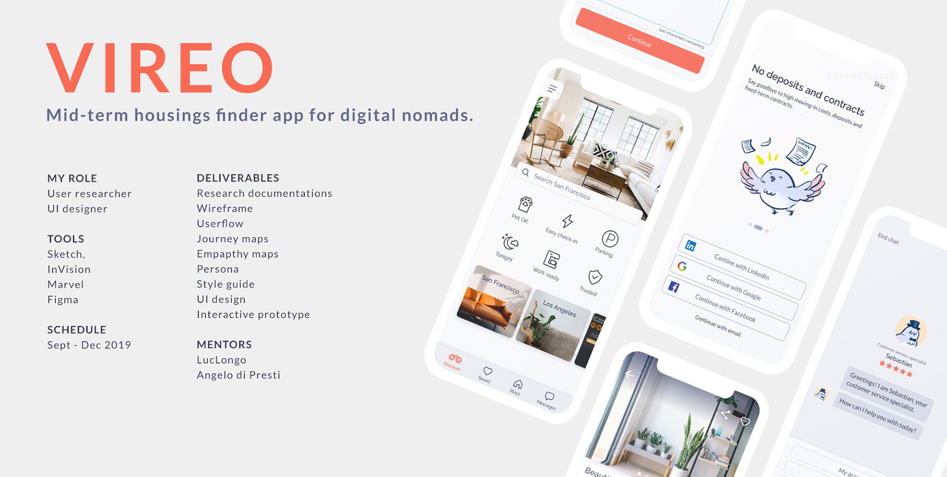
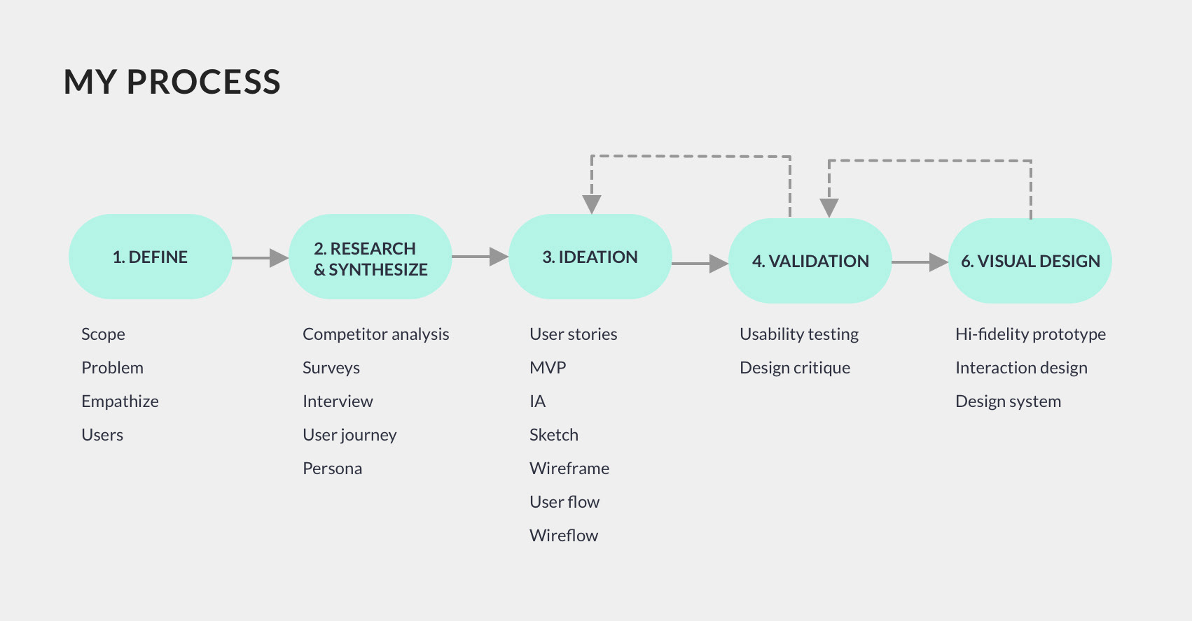
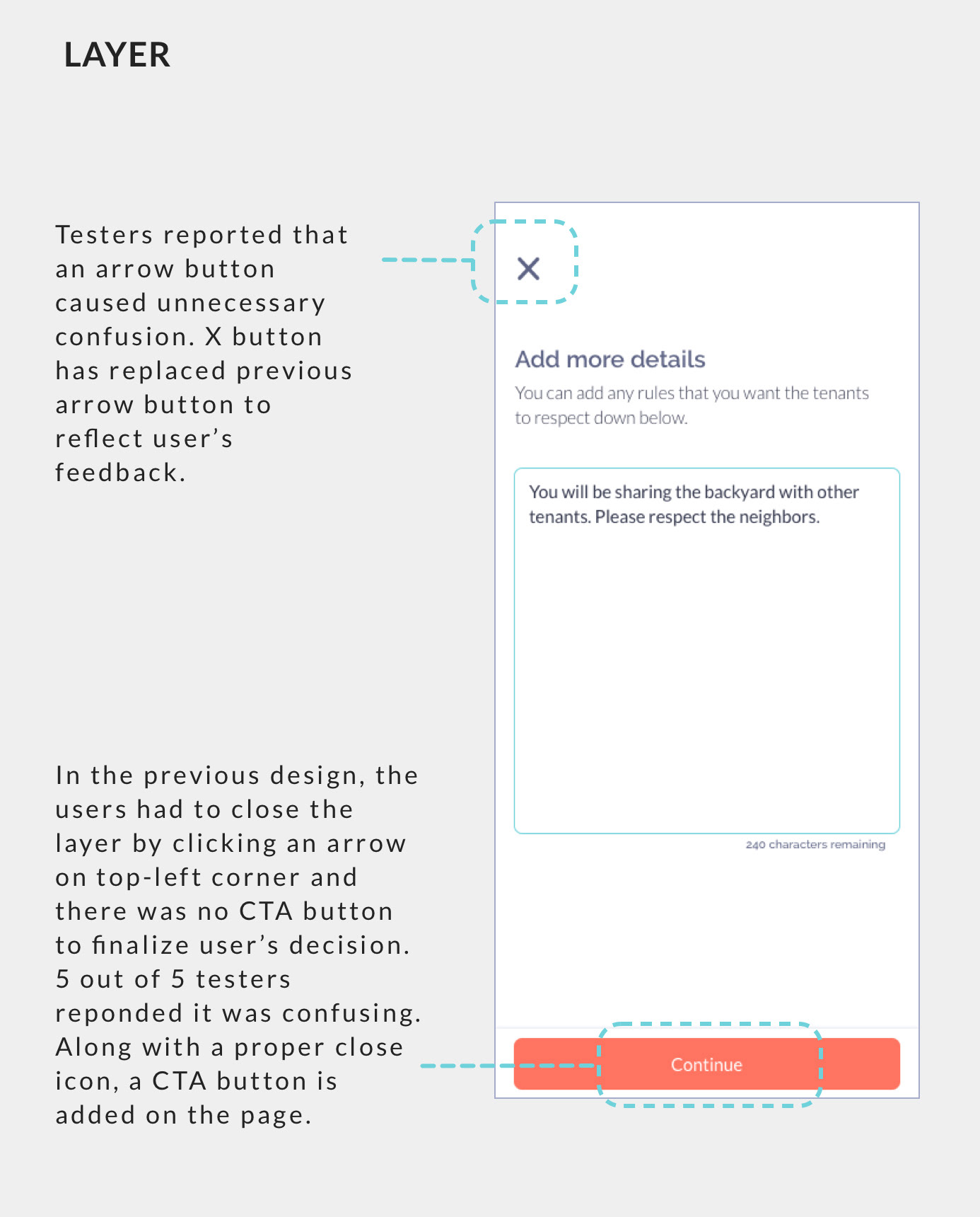
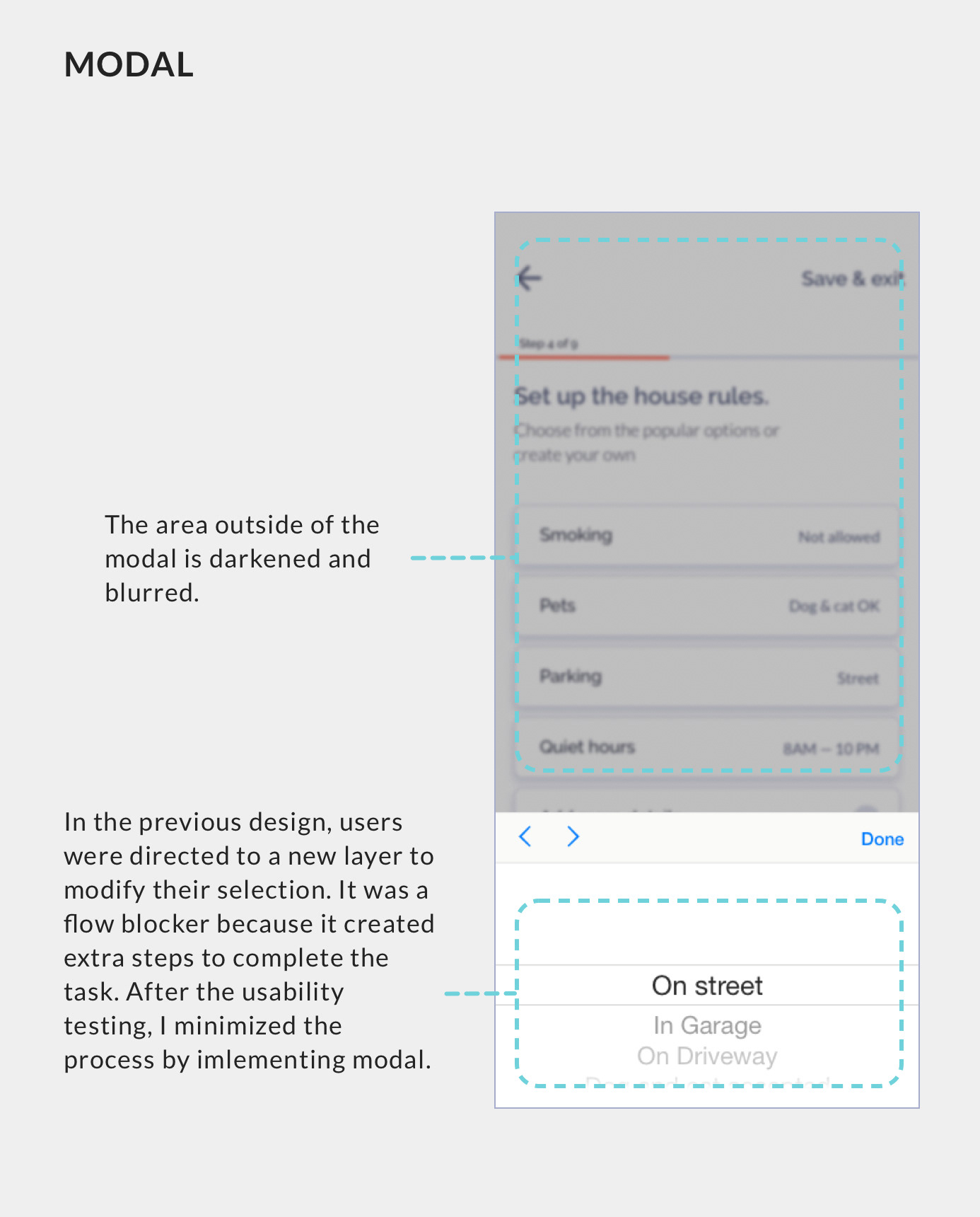
1. DEFINE
Identifying the Problem
Imagine yourself living in the basement of your parent's house in Chicago and you are actively looking for a full-time job. Suddenly, you get a call - you just got hired by a tech company in San Francisco! And another big news comes in - it's a contract-to-hire job. Which means you work for that company for only a few months. If they like you, they might hire you after the contract is over. If they don't, you got to leave. They don't offer corporate housing, and you have to find a place to live on your own, in a city you have never visited before. What housing options would you have? Does this scenario sound familiar to you?
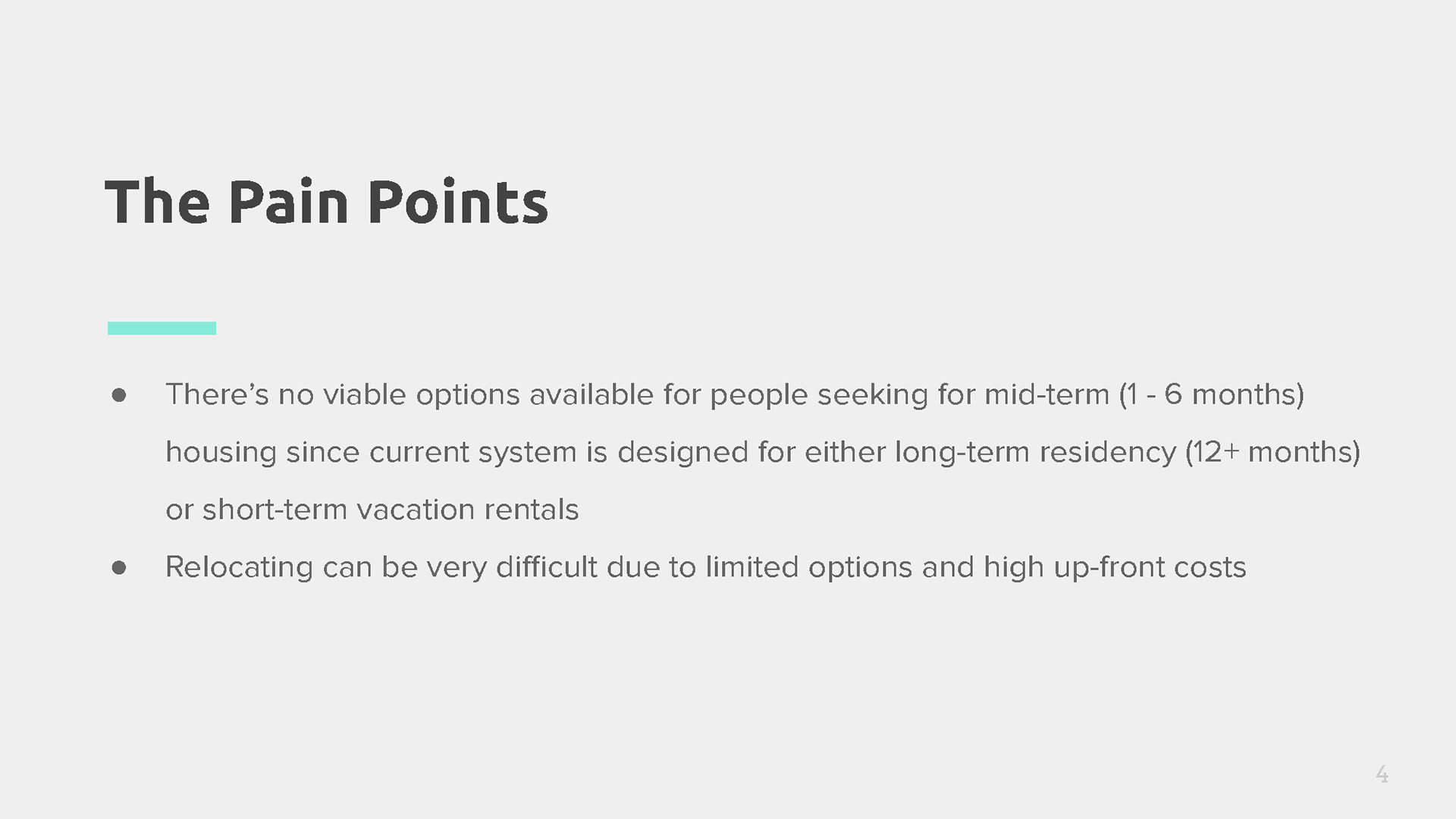
Whether you are a "digital nomad" or someone just trying to survive in this economy, you are left with limited options when it comes to mid-term housing search. I mean, what options do you have, really? — staying at a hotel? It would be too expensive. Airbnb could be a good alternative, although people mostly use the service for vacation rentals. Craigslist is infested with scammers.
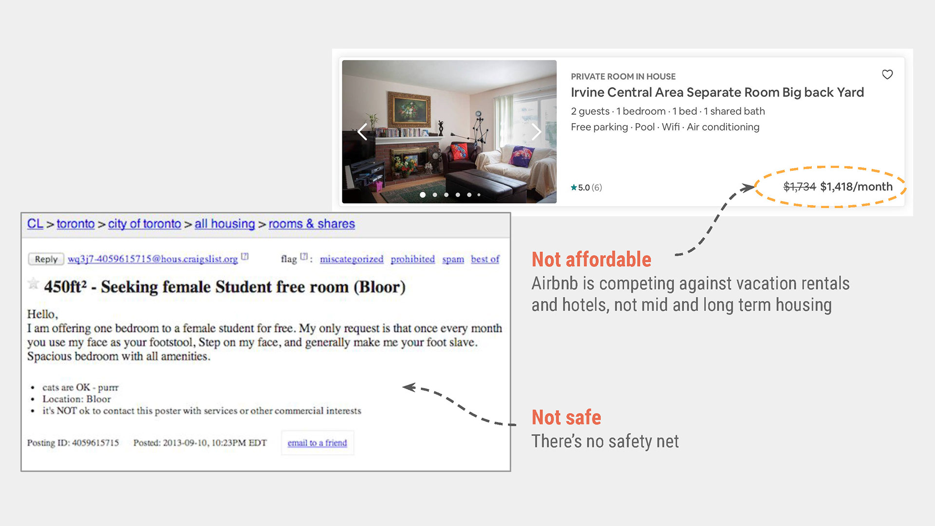
You might think, "Why don't you go find an apartment?" Yes, that is one of the options, but the management would require you to pay the deposit, first-month rent, and last month's rent at once which could sum up to several thousand dollars. Also, you will have to sign your mandatory 12-months contract, and they are going to chase you down until the end of time if you try to break the lease early and don't pay the early termination fee of another several thousand dollars.
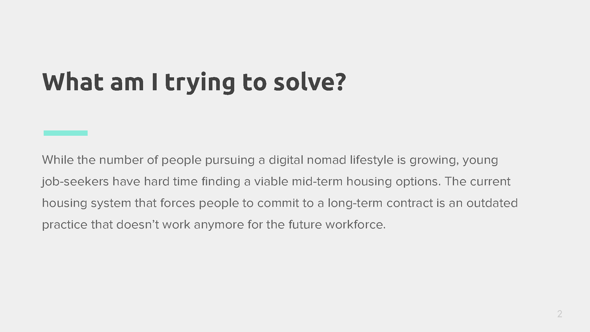
The Hypothesis
"Mid-term housing seekers are frustrated because the antiquated housing system doesn't meet the standards of the workforce of today."
2. RESEARCH & SYNTHESIZE
Verifying my hypothesis
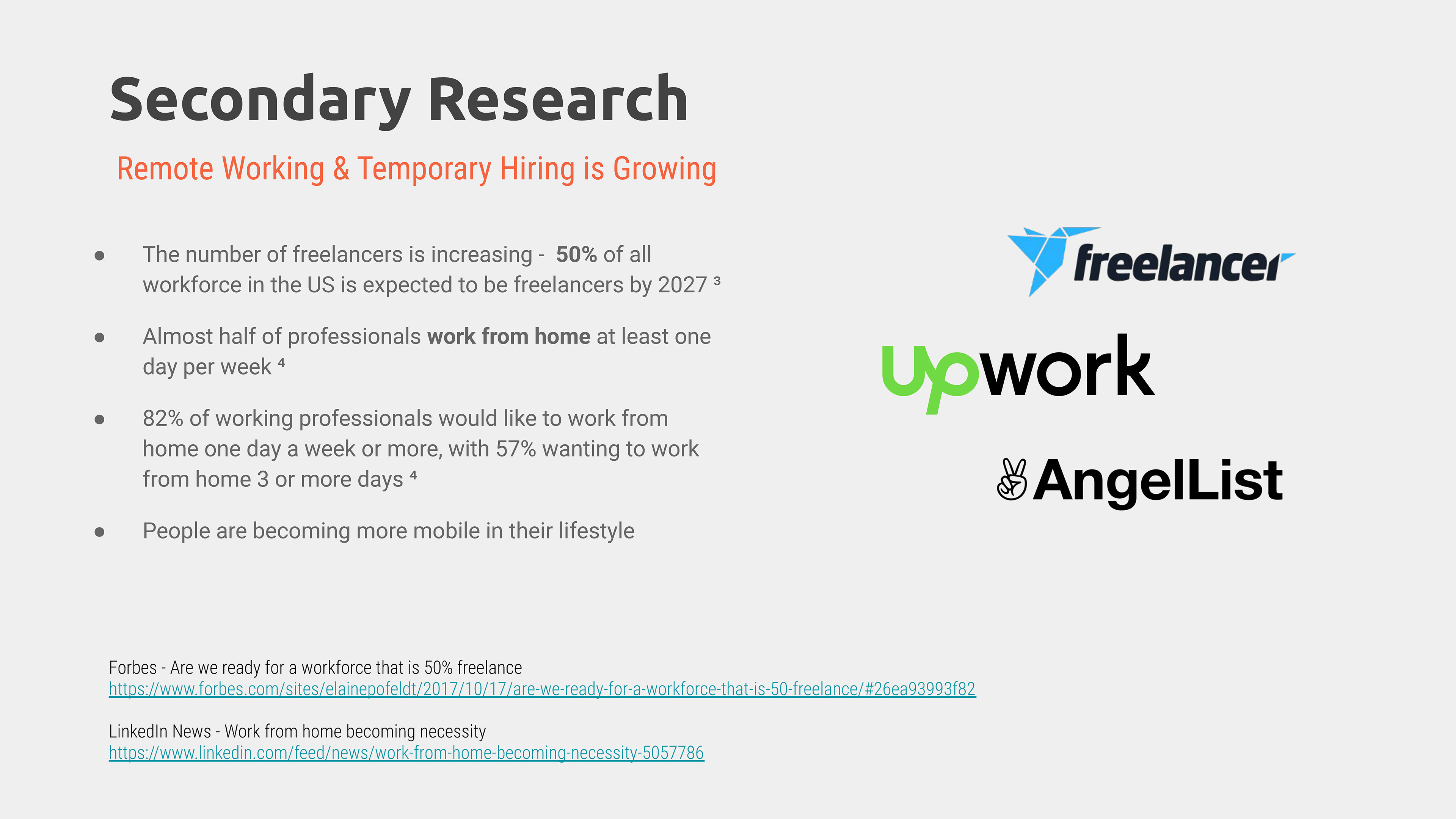
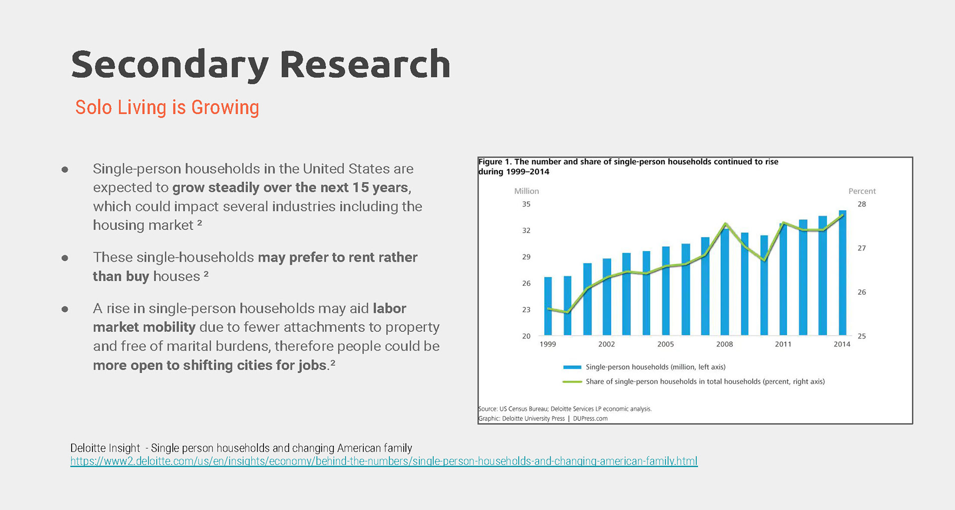
To make sure that I am not wasting my time trying to solve a problem that doesn't even exist, I conducted secondary research to gather data and evidences. My hypothesis is just based on my own experience and it's merely an assumption at current state. Is the problem I am trying to solve really a problem for others too?
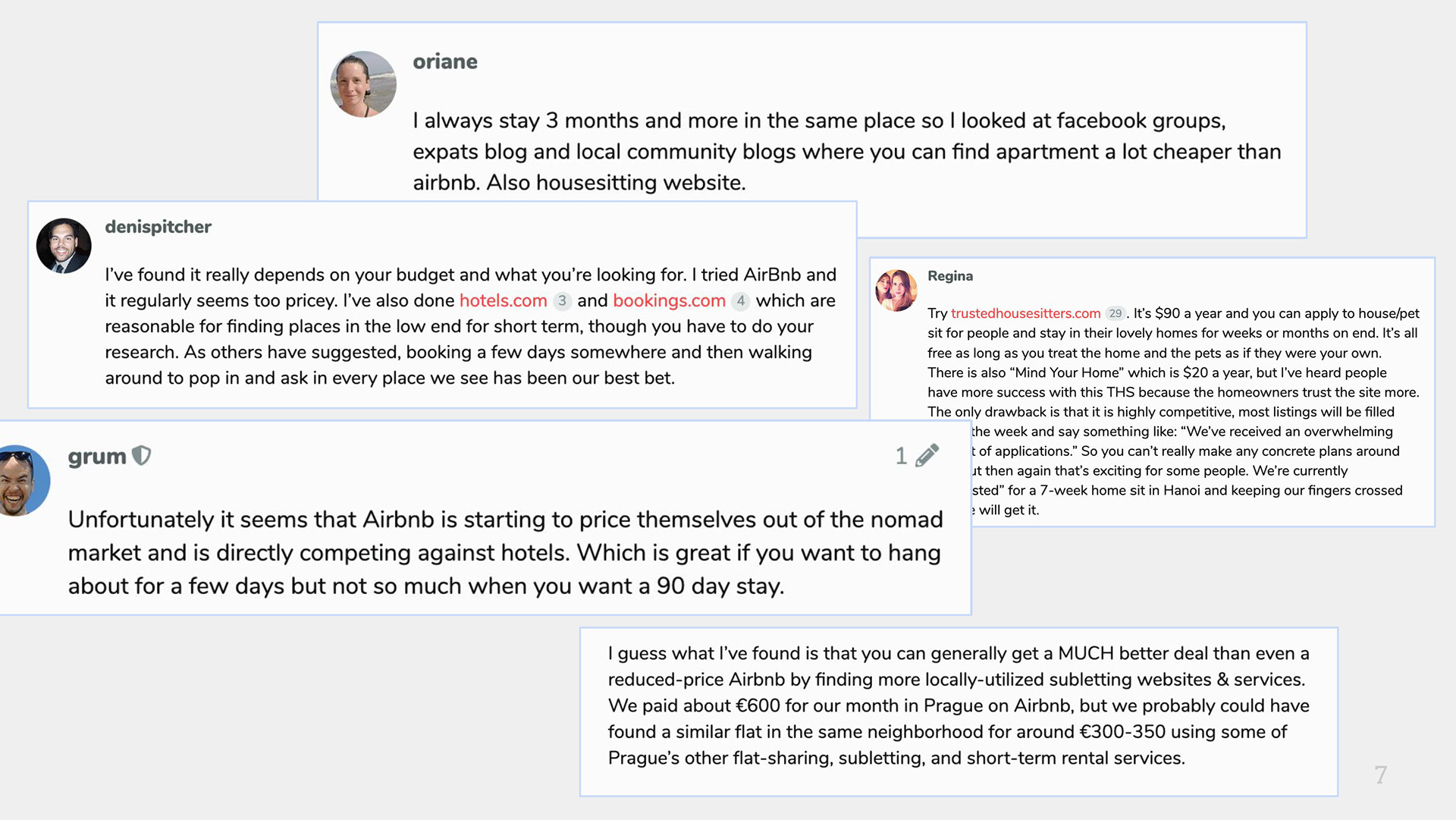
What do people say on the internet?
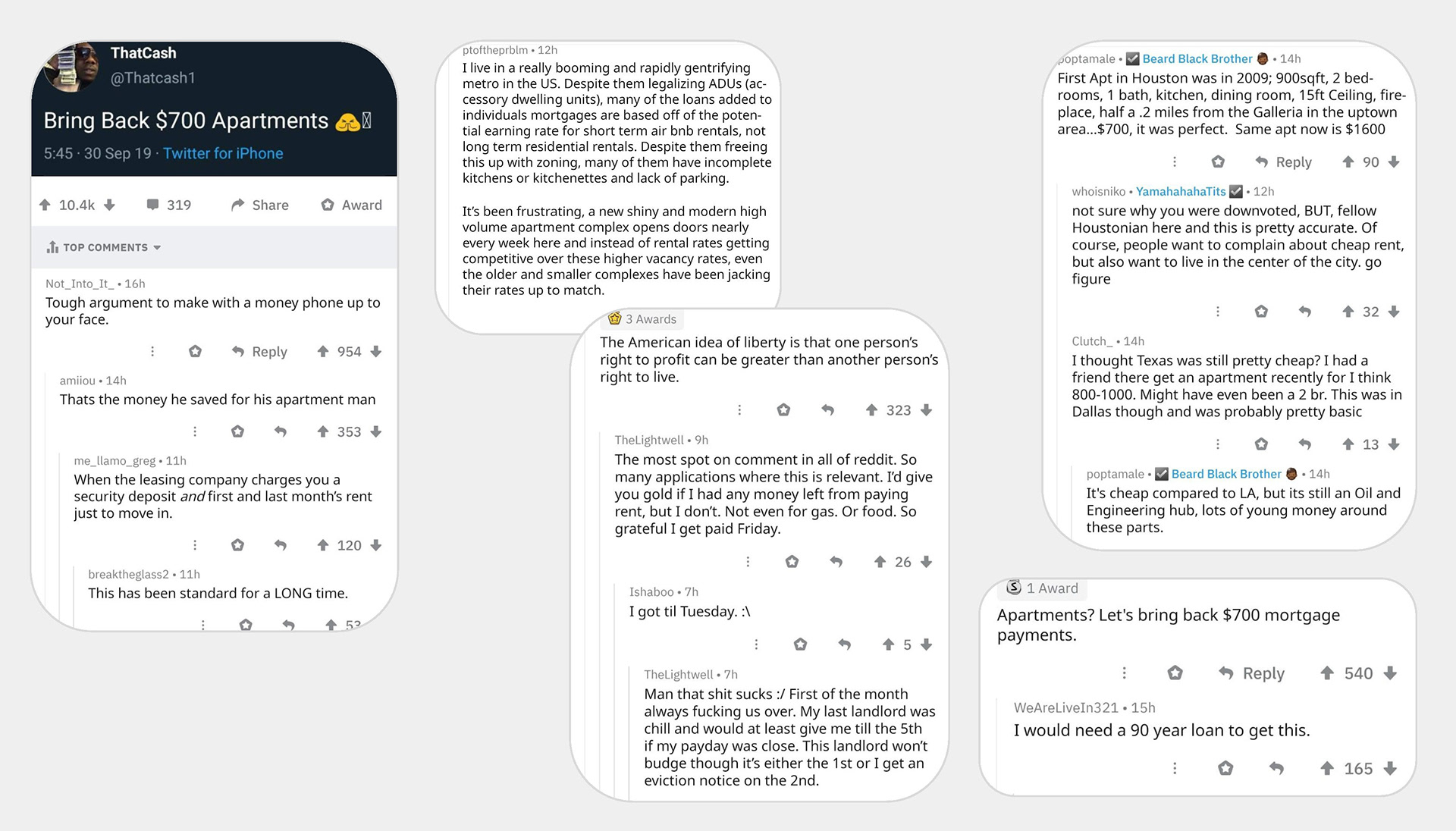
I've looked at online forums like Reddit, Quora and Nomad List to get a general idea of what people would say about this issue. As a result, I was able to verify some of my assumptions. Not only mid-term housing options are almost non-existent, housing market in the US is not in a good shape and people are frustrated.
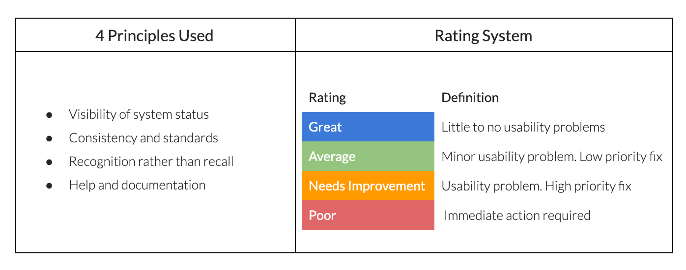
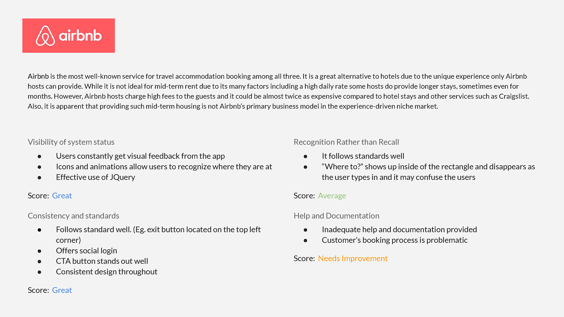
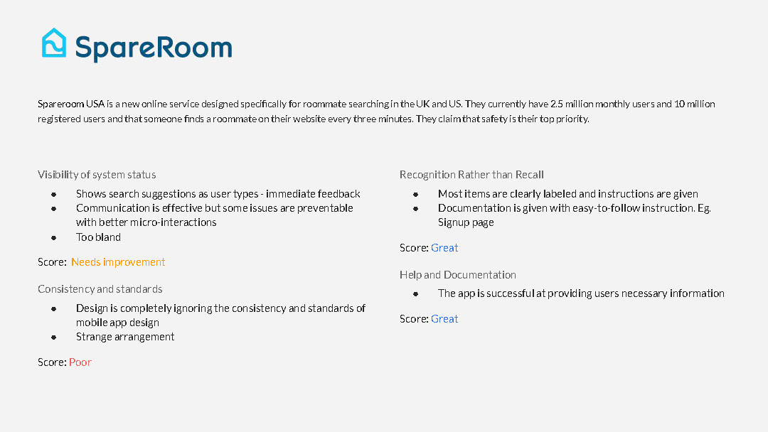
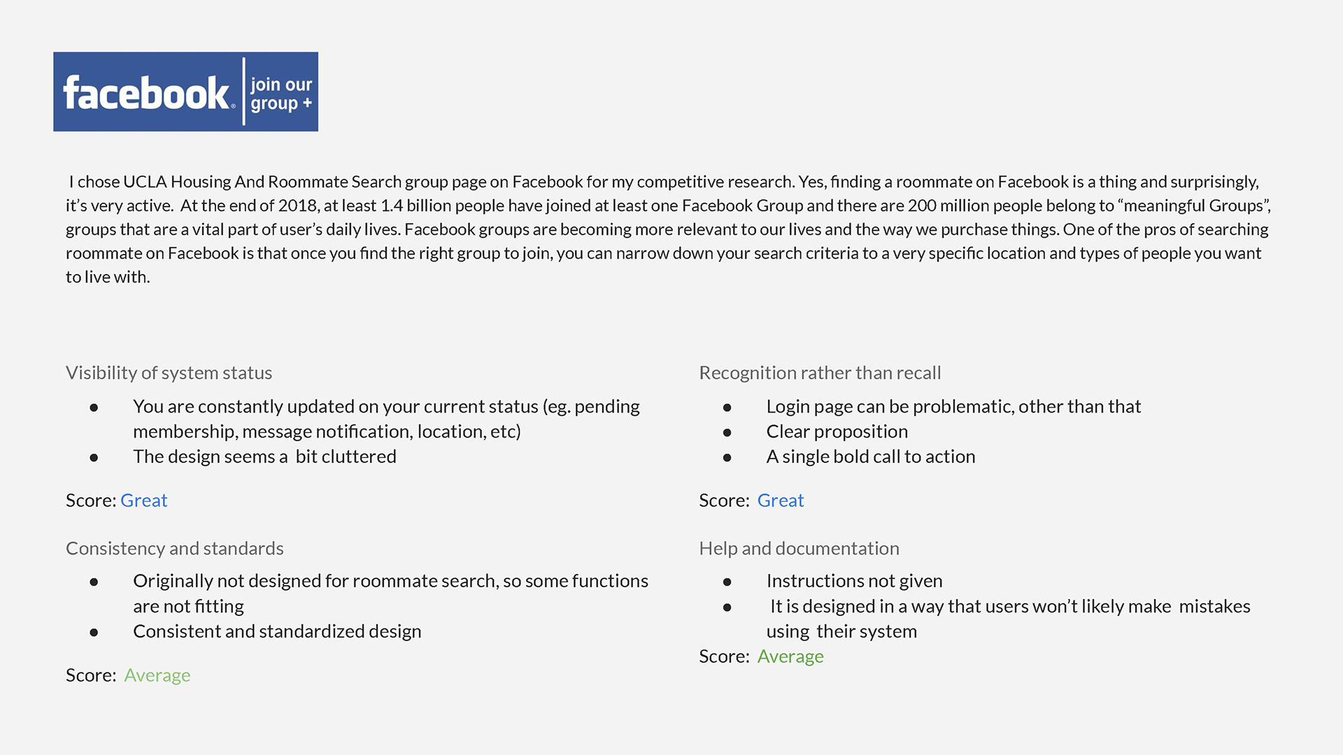
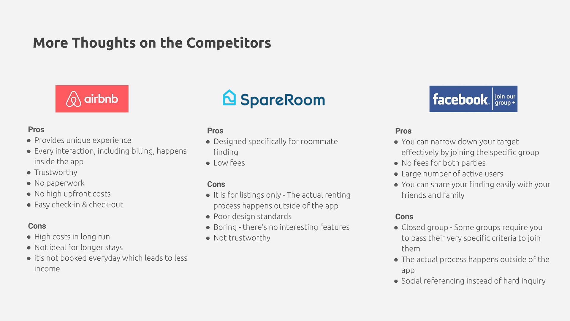
Heuristic Evaluation of Competitors
To learn from existing services, I identified 3 competitors, Airbnb, SpareRoom and Facebook Group. Also, they were evaluated on the basis of four of the ten principles of the Nielsen Norman Usability Heuristics.
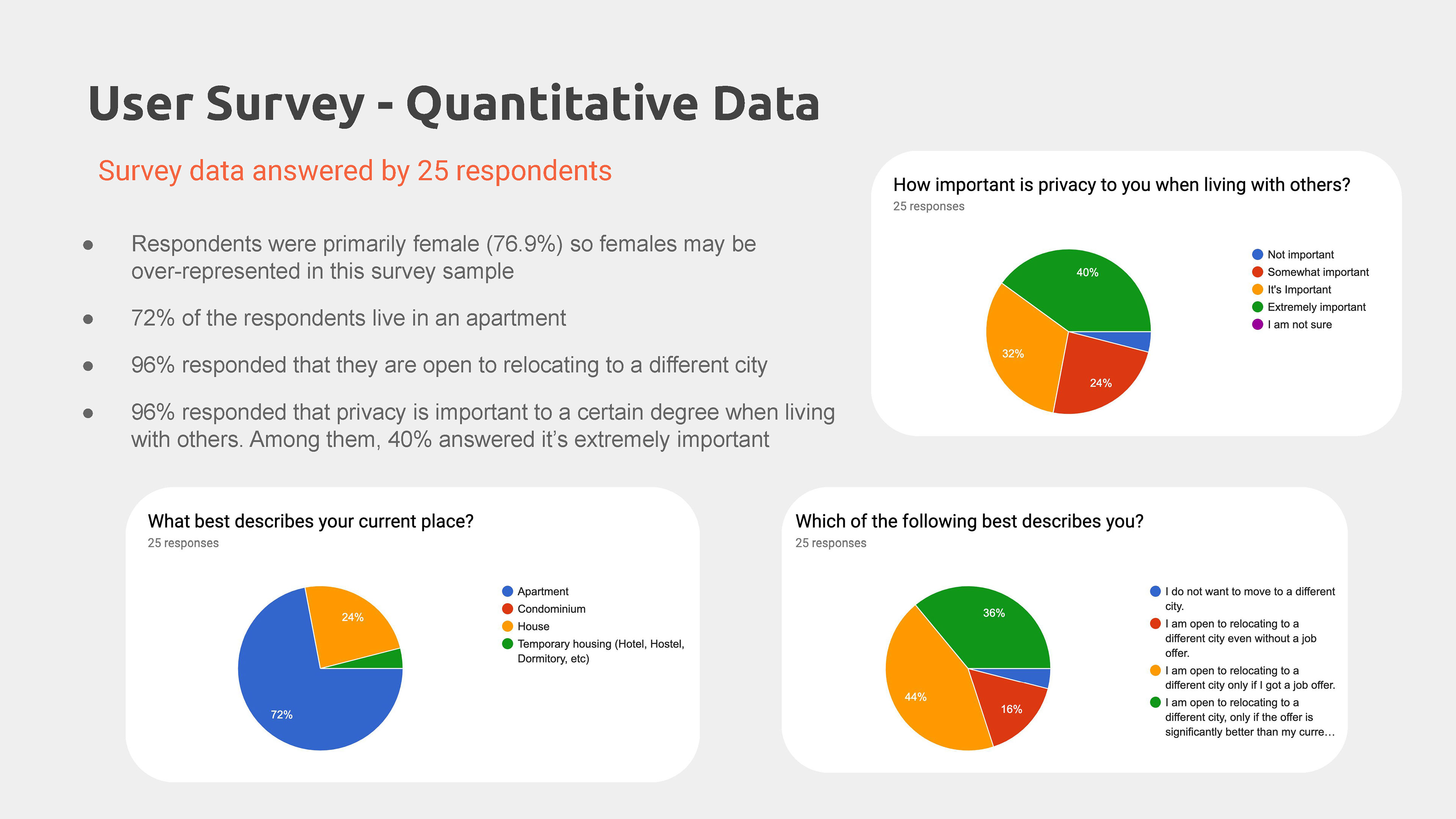
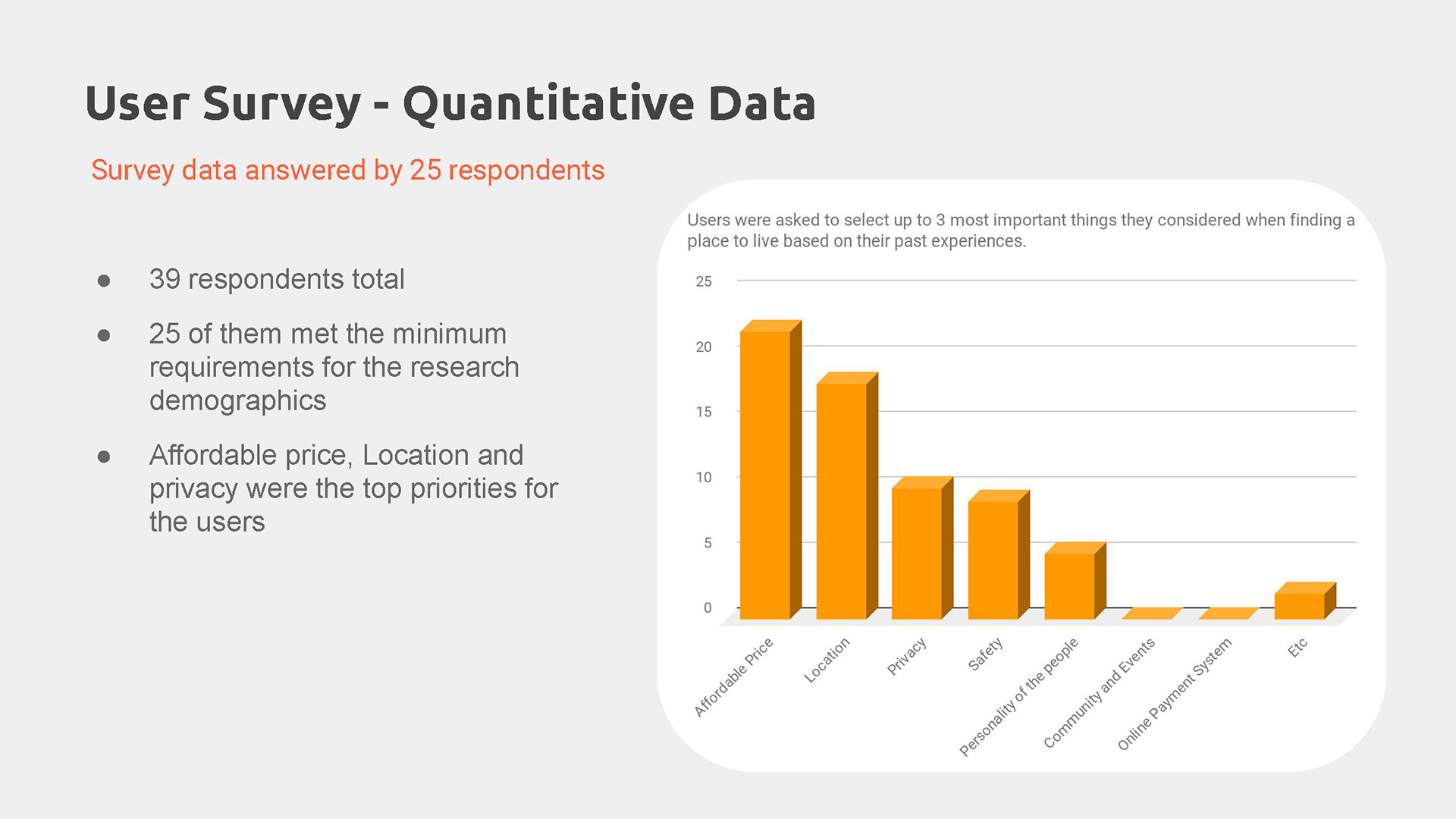
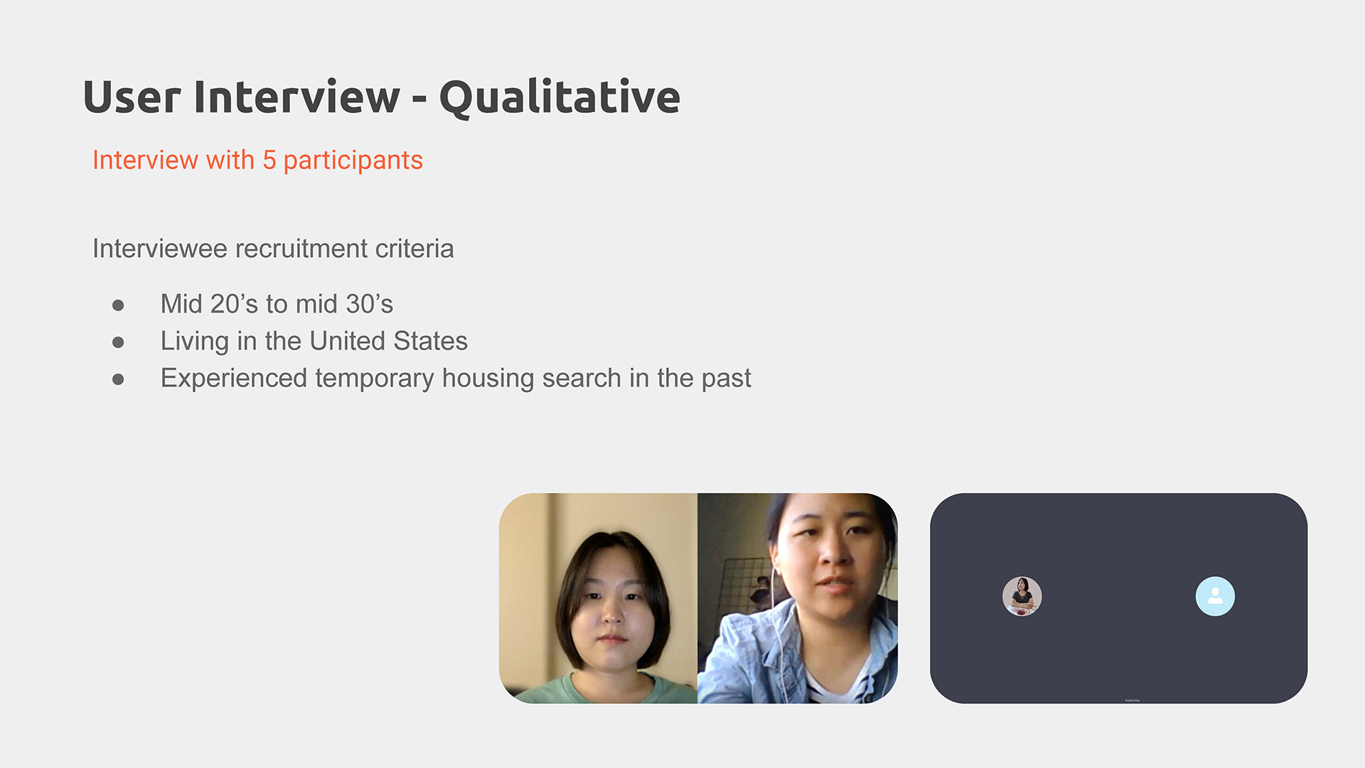
User Survey and Interview
Still, further research was needed to prove my hypothesis. I posted a screener survey on my LinkedIn, Instagram and slack channels to gather participants.
During the user interview, I avoided questions like "what is your plan?" or "Would you move to the UK if you get a job offer?" which would make them predict the future because that would be ineffective.
Instead, I asked questions about their past experiences and why and how they made their decisions. The items included, "What made you decide to move to your current place?" "Can you walk me through the process?" "What were the major things you had considered when you moved in?" "Have you ever moved to a different city or state? Why and why not?"
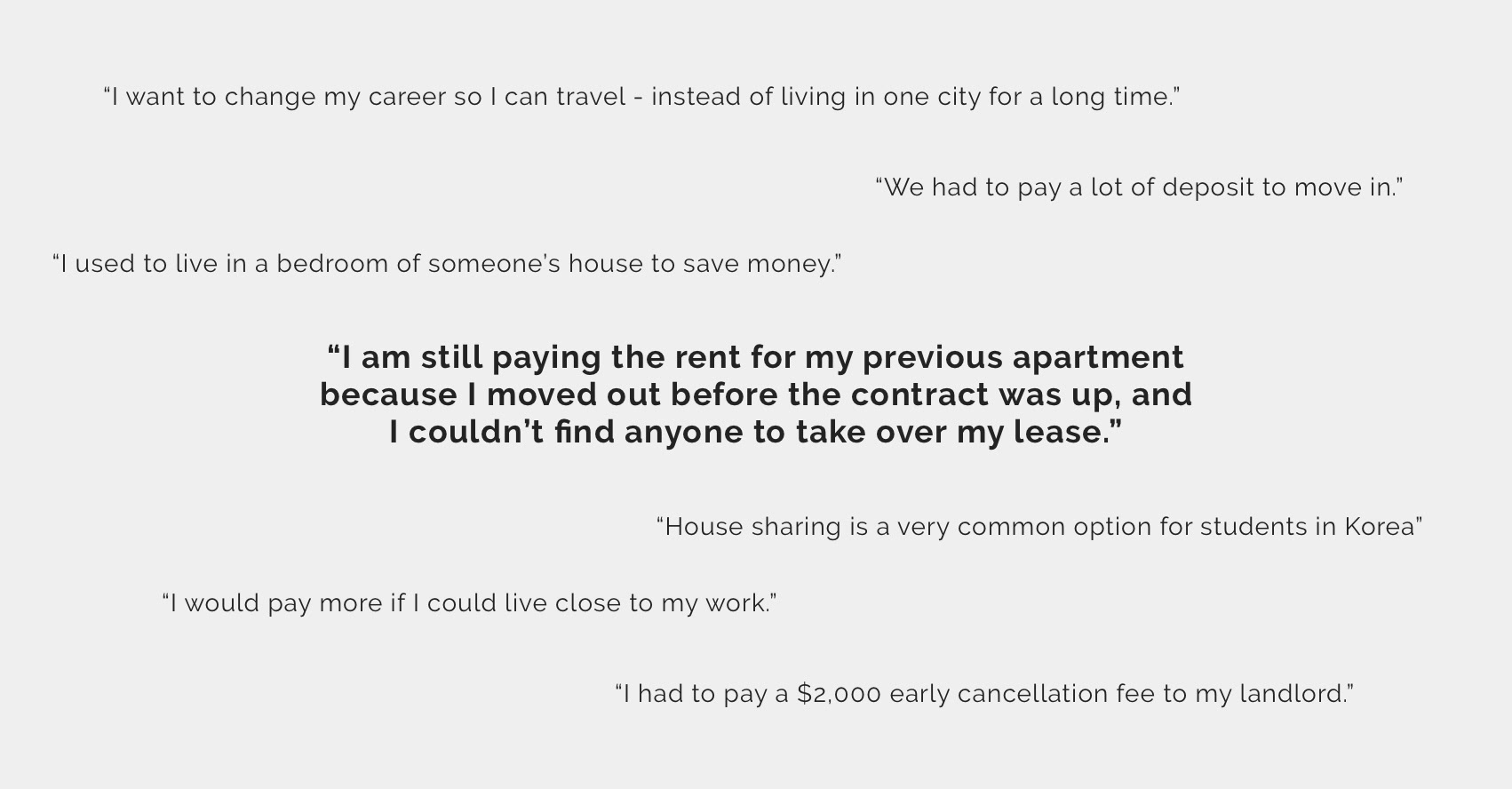
User Quotes
I was surprised that all of my interviewees has some kind of issues with their housings in the past although their occupations, locations, and cultural backgrounds varied. After the surveys and interviews, I concluded that the current housing system doesn't work for my target user group. Not only that, it makes people's lives miserable to a certain degree.
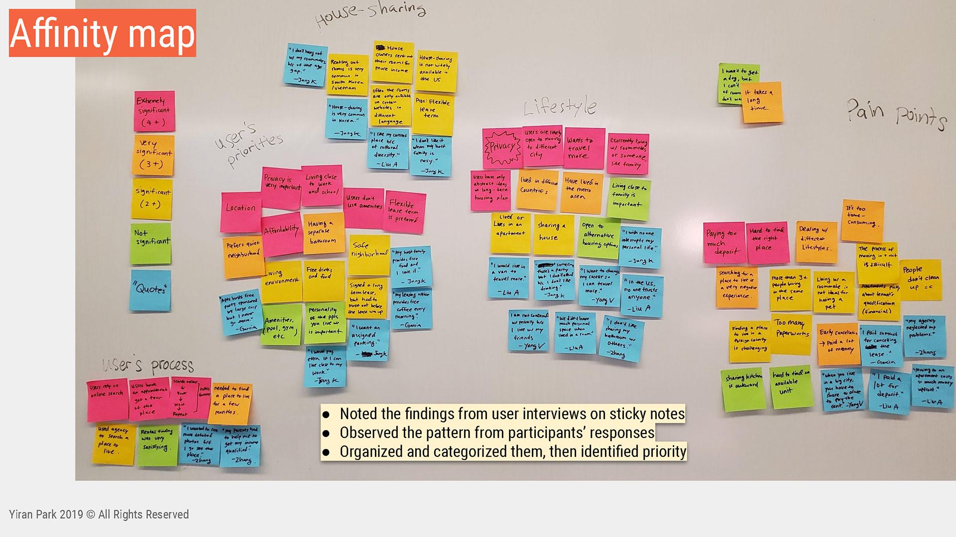
After the interviews, I created an affinity map by distilling, categorizing and prioritizing the research findings.
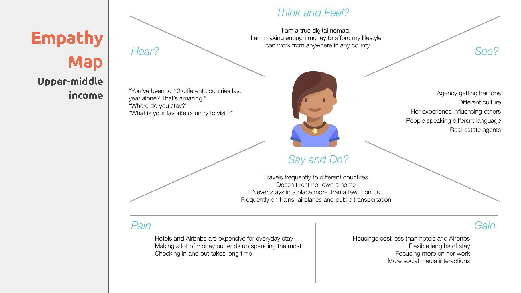
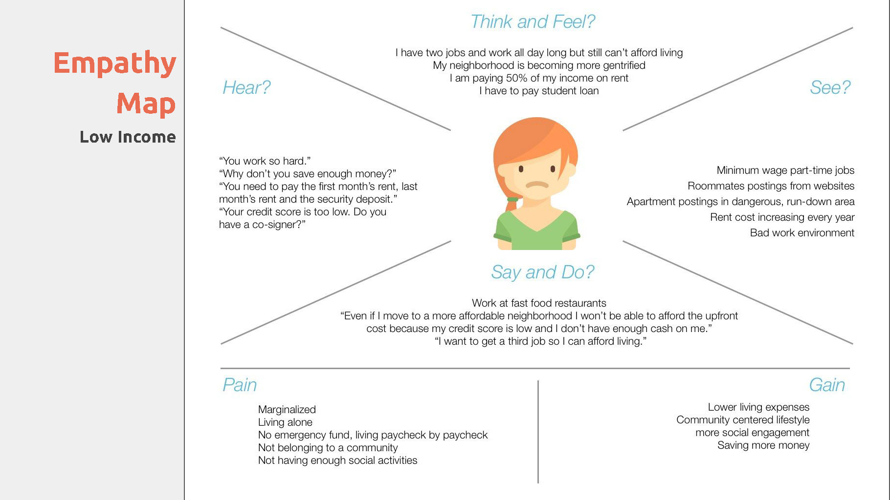
Empathy map
Before creating personas, I made the empathy maps to visualize the user's attitudes and behaviors. What they say, think, do, and feel could vary, and it was critical to identify those differences.
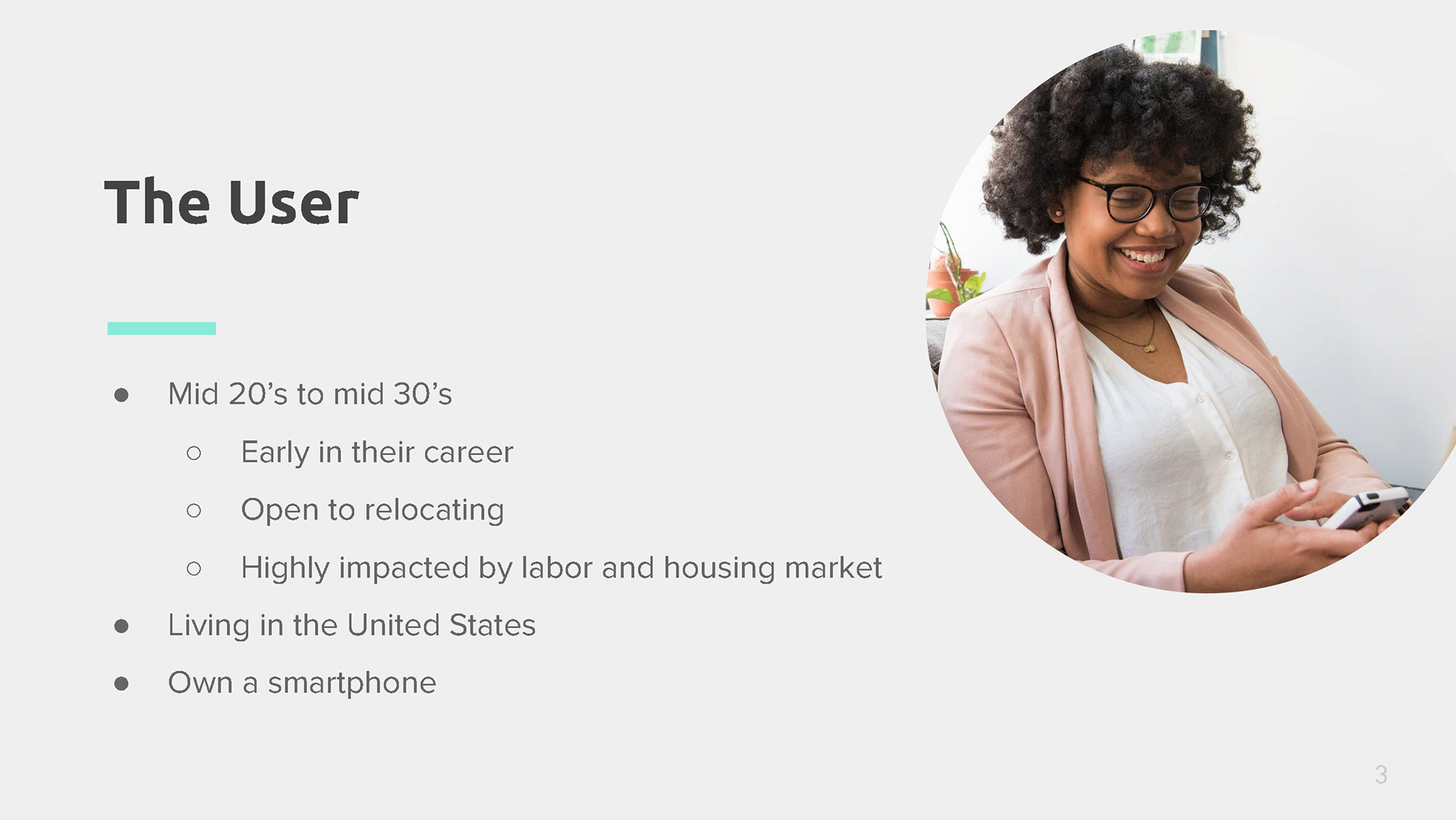
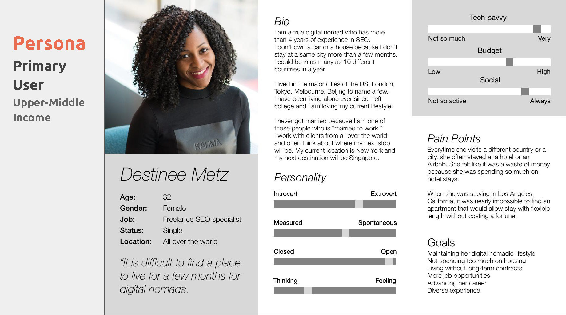
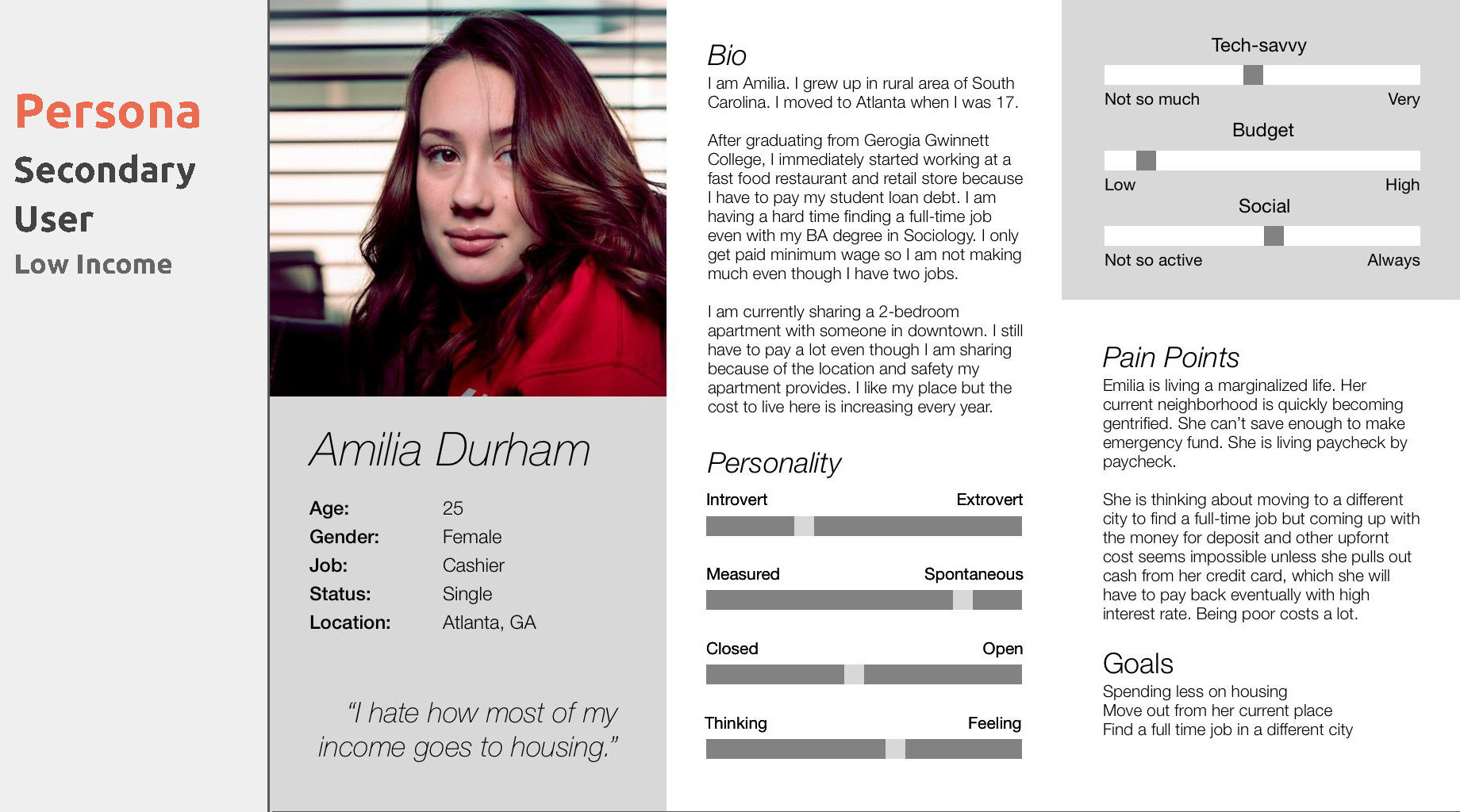
Persona
I've created two personas. Destinee represents the primary user groups with upper-middle-income and Amilia represents the secondary user group with lower-income. Why did I categorize them into two different groups based on their income? Because I found from the user research that the need for mid-term housing applied the same to people with varying levels of income.
Their motivation might be different, but their end goals would be the same. After all, they are all searching for a place to live.
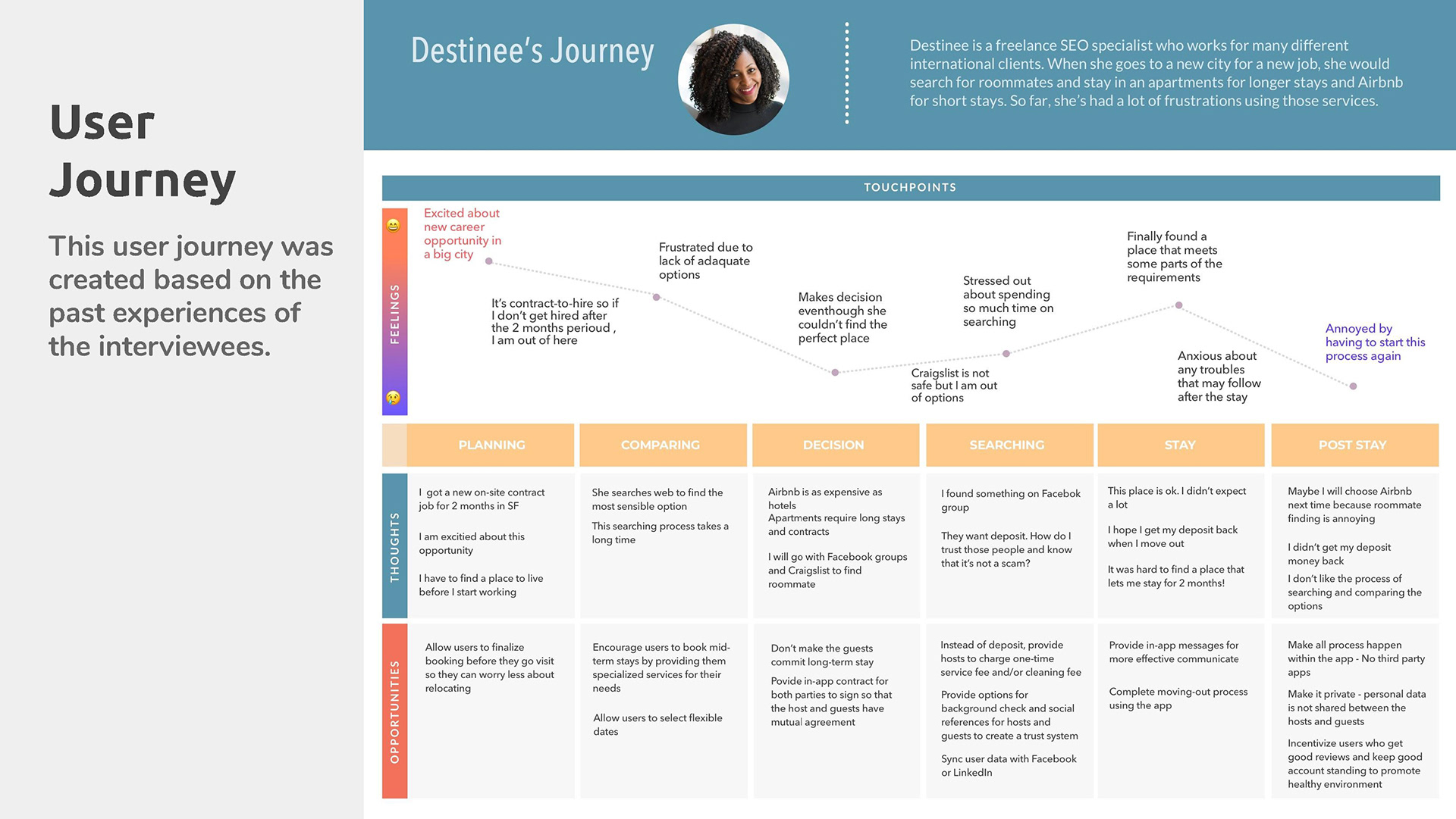
Destinee's user journey.
User insights
Here are the essential findings I learned from the user surveys and interviews.
• They want a flexible length of stay without getting overcharged.
• They don't want to pay too much upfront costs when moving to a new place.
• They want to work and travel to different cities and countries.
• They want to live in a space that provides privacy.
• They prefer a convenient location.
• They want a flexible length of stay without getting overcharged.
• They don't want to pay too much upfront costs when moving to a new place.
• They want to work and travel to different cities and countries.
• They want to live in a space that provides privacy.
• They prefer a convenient location.
The HMW statement
After I have identified the user's frustrations, needs, and wants, I came with How Might We questions, the key issues that I must answer when designing a product.
• How might we help people find an affordable place to live that provides a convenient location, safety, privacy, and flexible length of stay?
• How might we offer a satisfactory experience for both tenants and landlords?
• How might we help people move to different cities without worrying about instability?
• How might we make the rental market a fair game for all parties?
3. IDEATION
User stories, MVP and IA
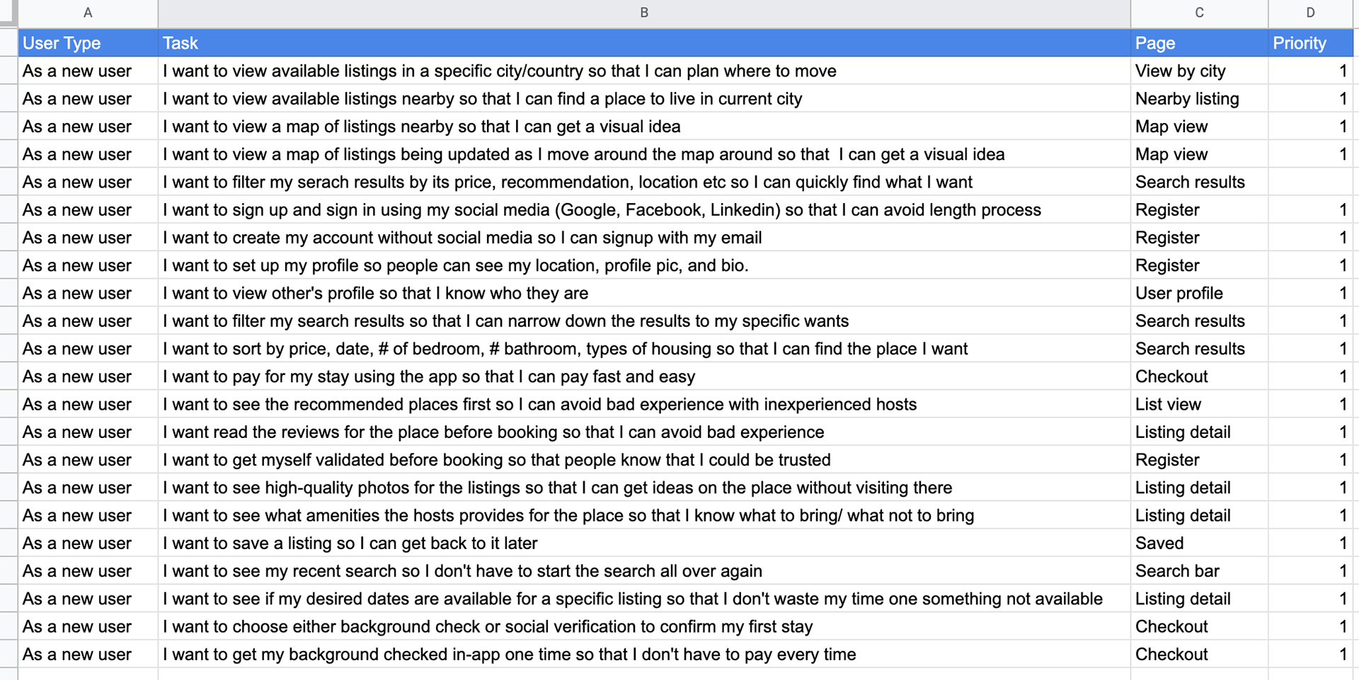
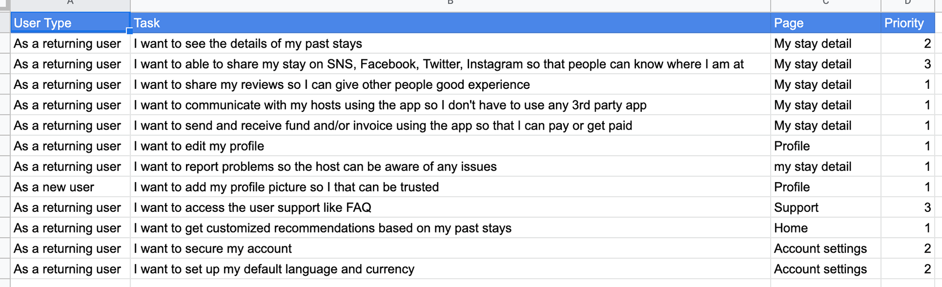
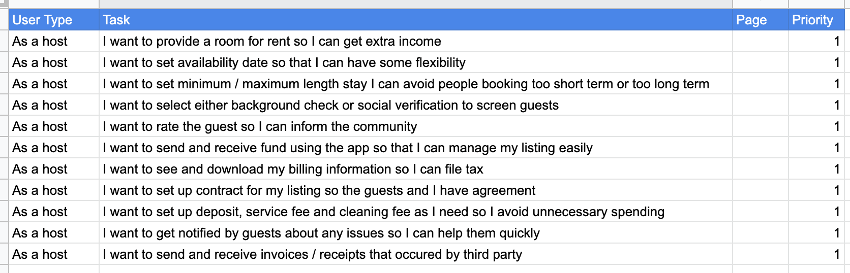
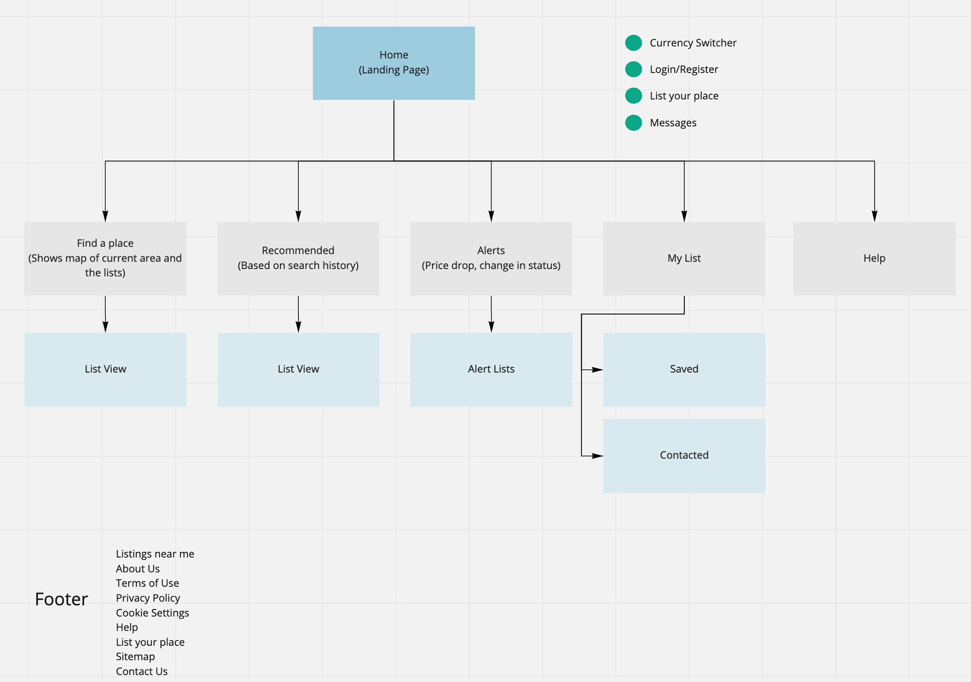
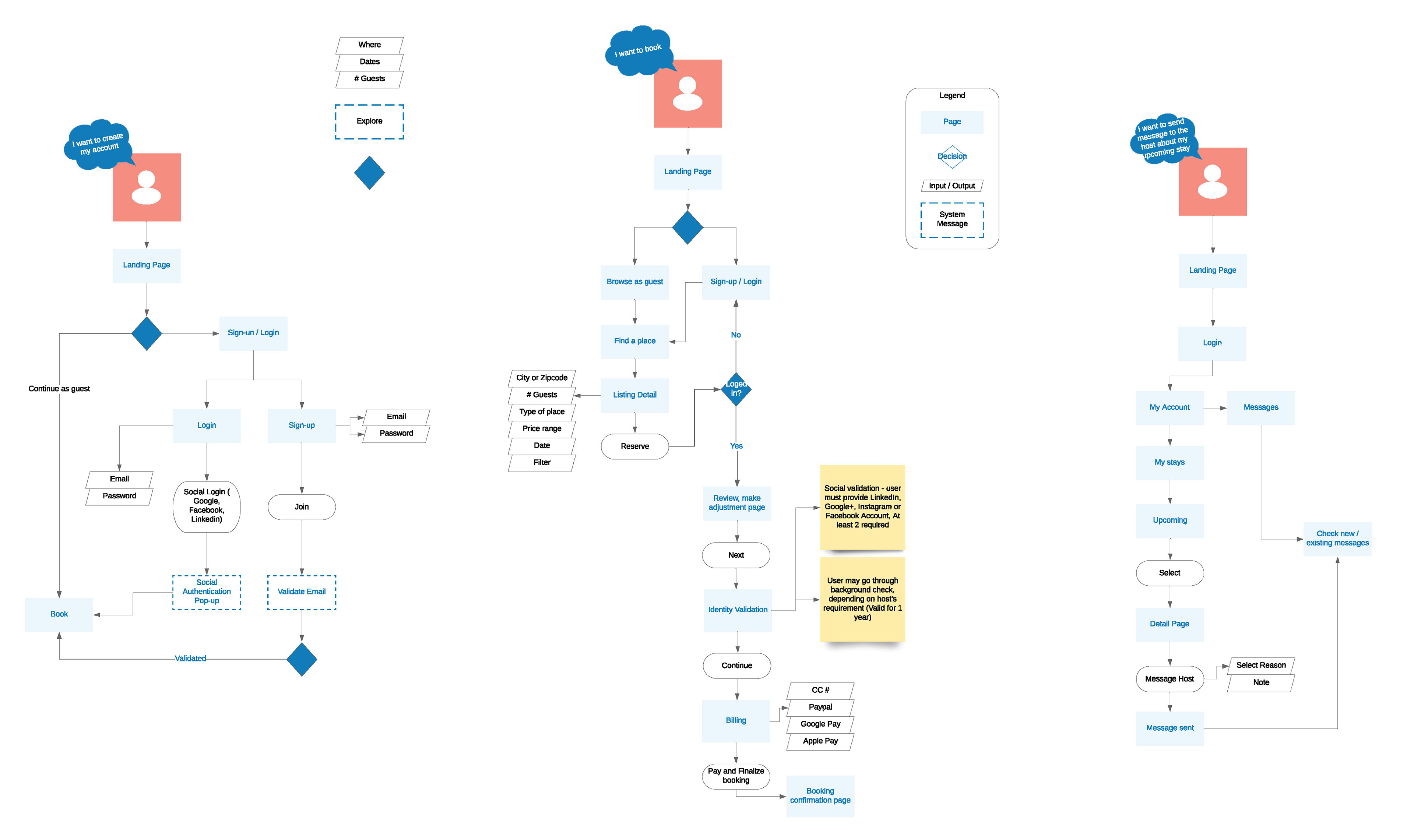
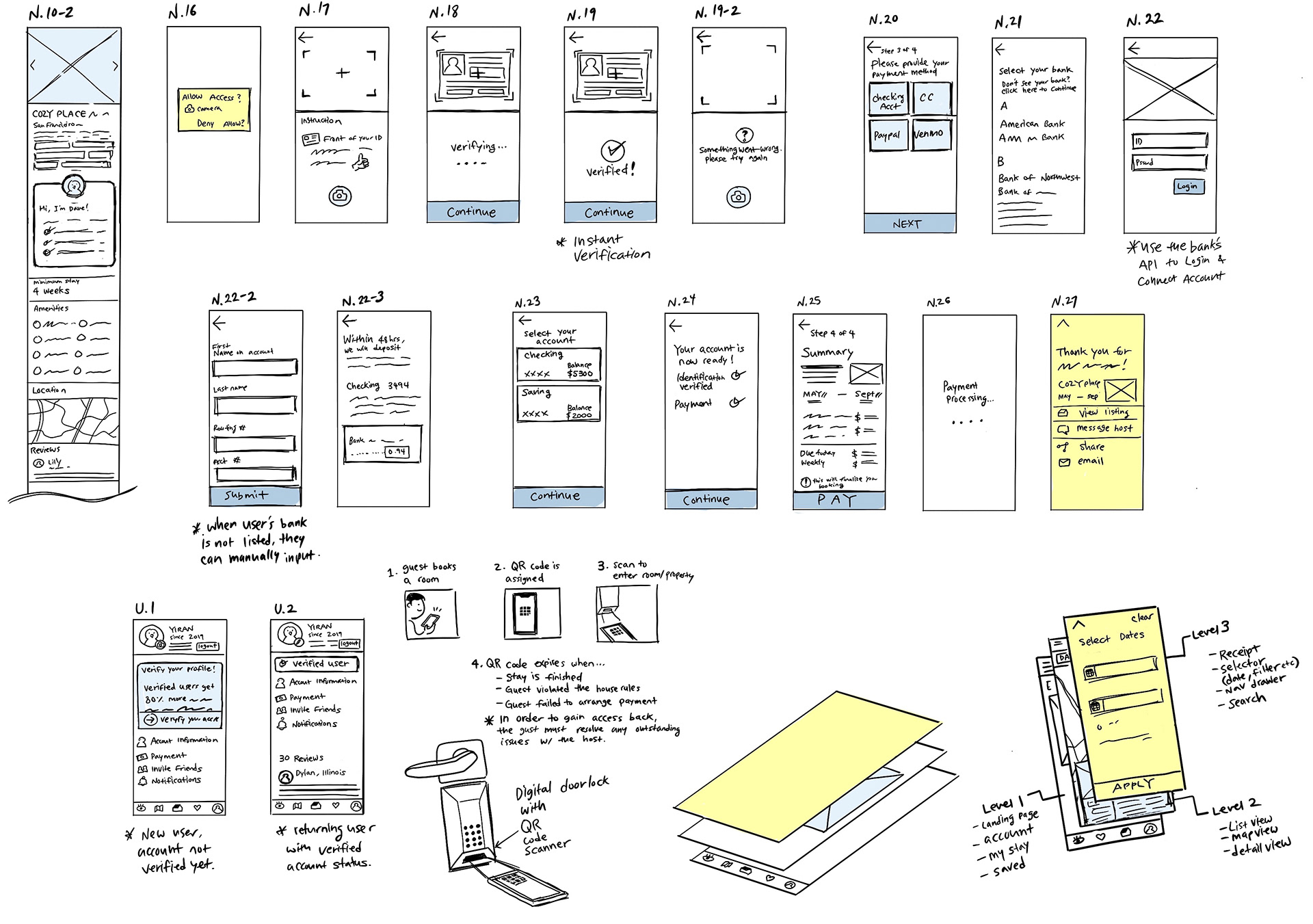
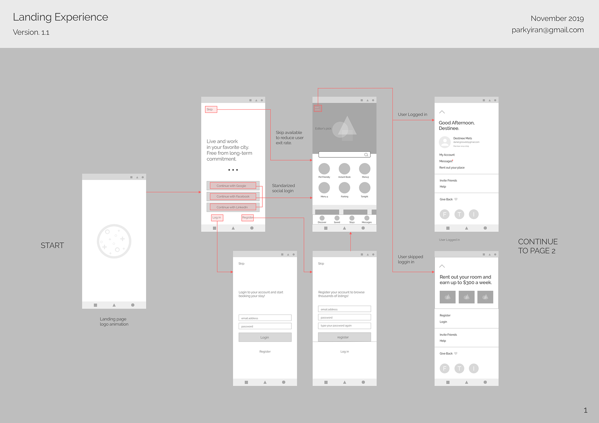
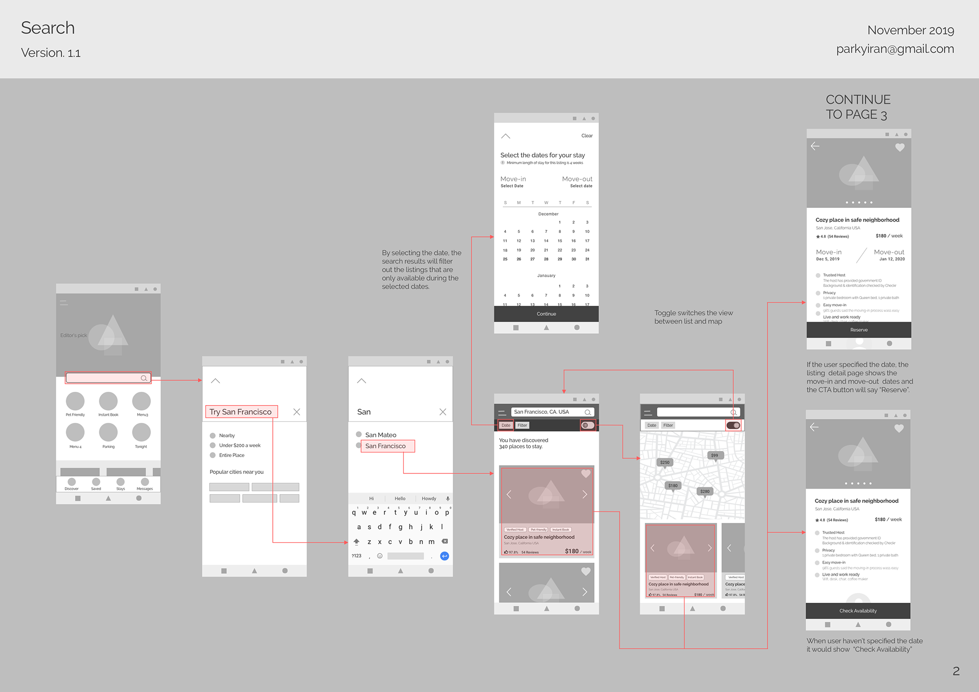
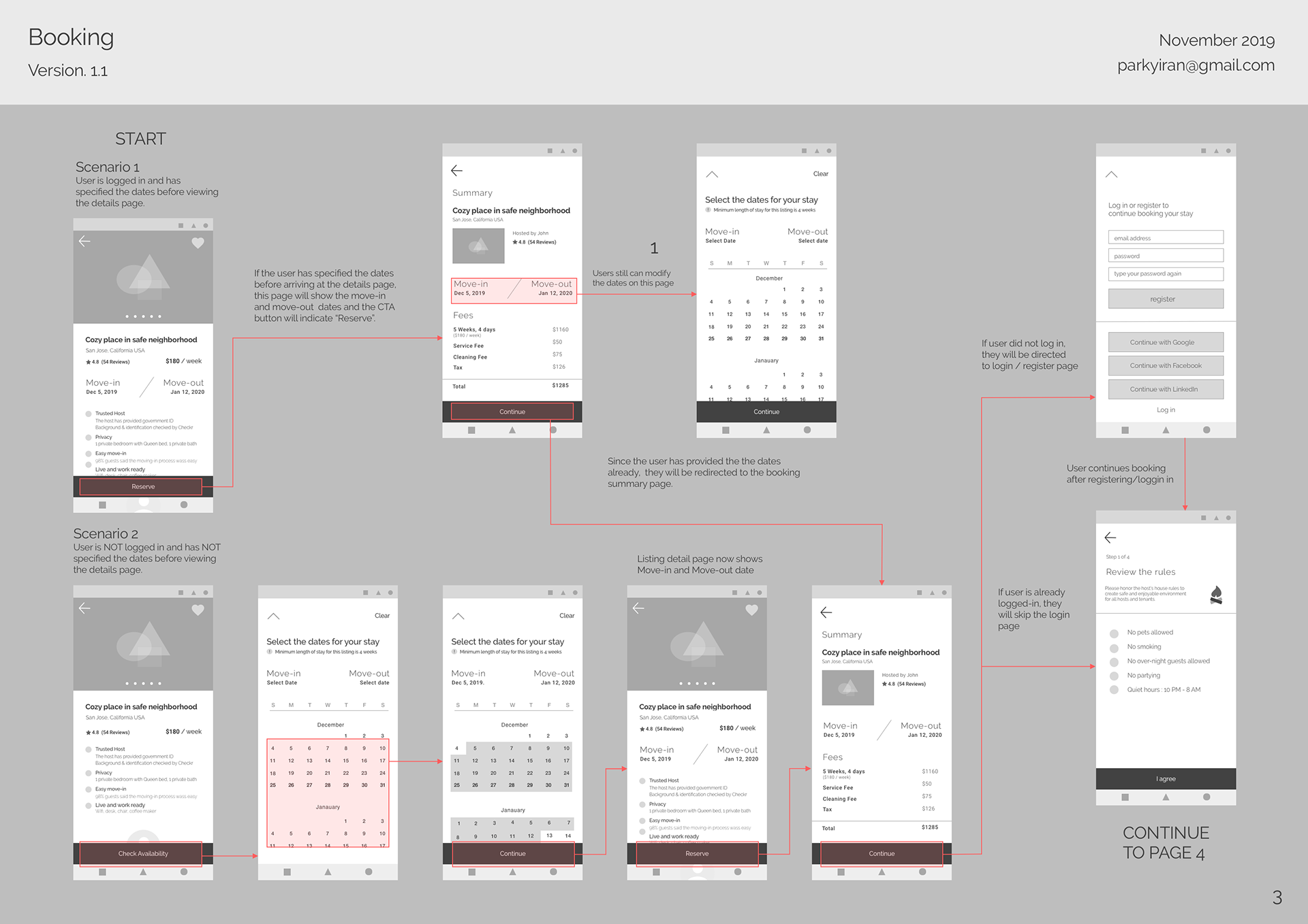
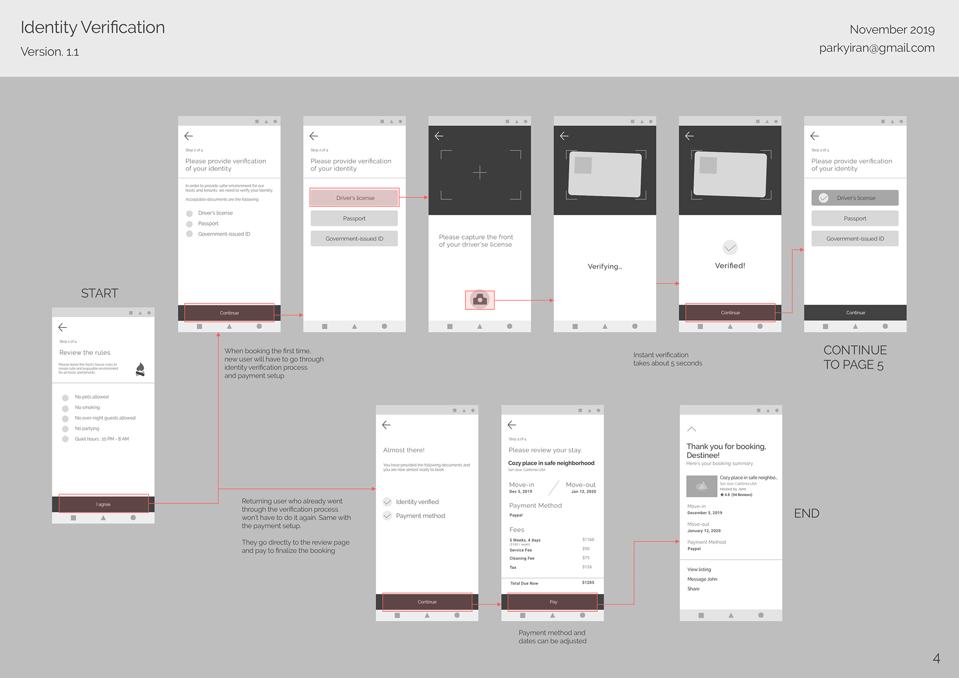
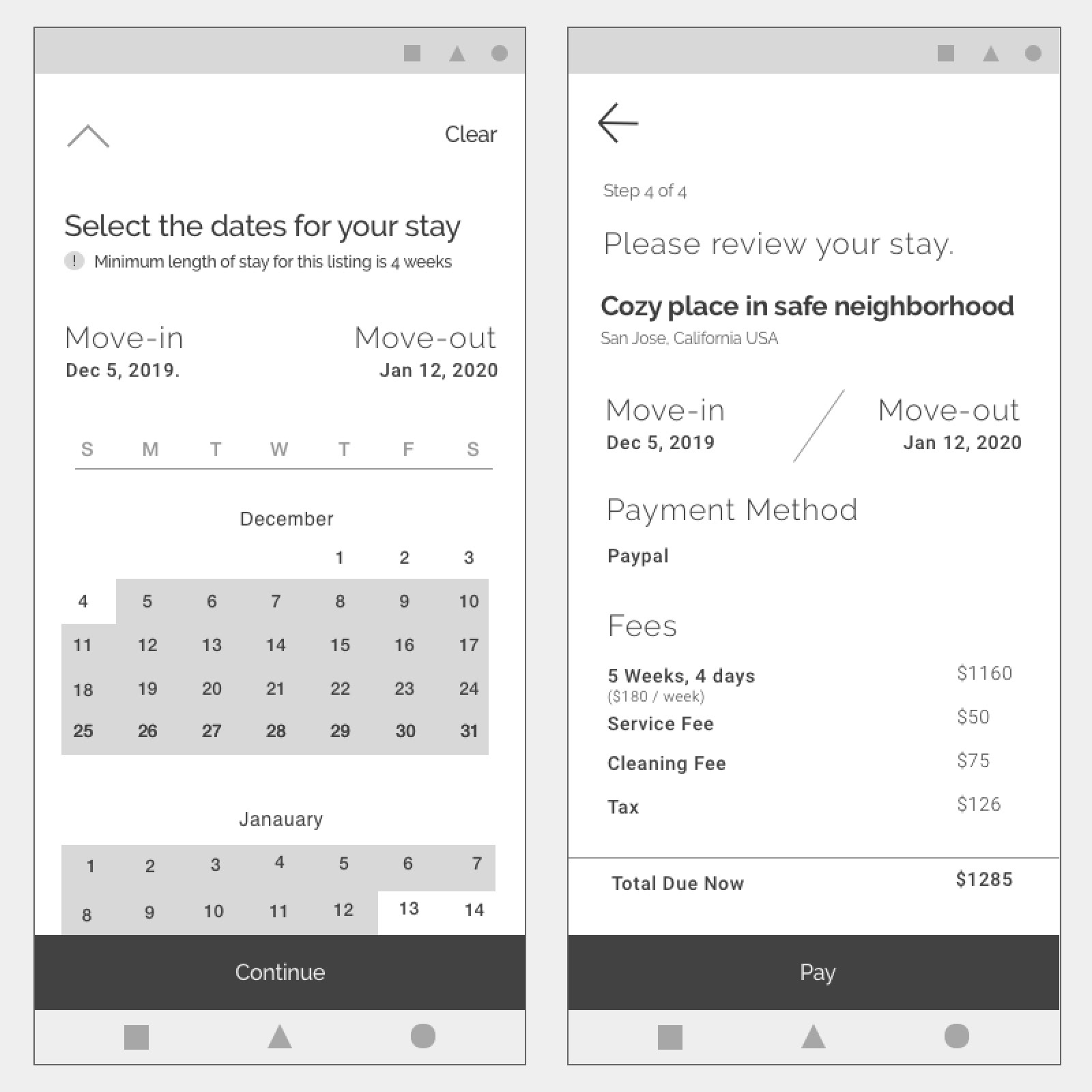
I categorized users into three different types - new user, returning user and the host. I identified tasks each user group would want to achieve then categorized the tasks based on the priority. The high priority tasks would be included in the MVP. As the priority is being figured out, I created sitemap and the userflow.
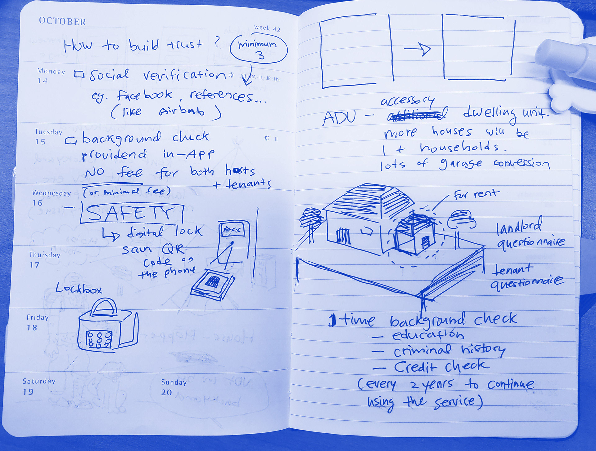
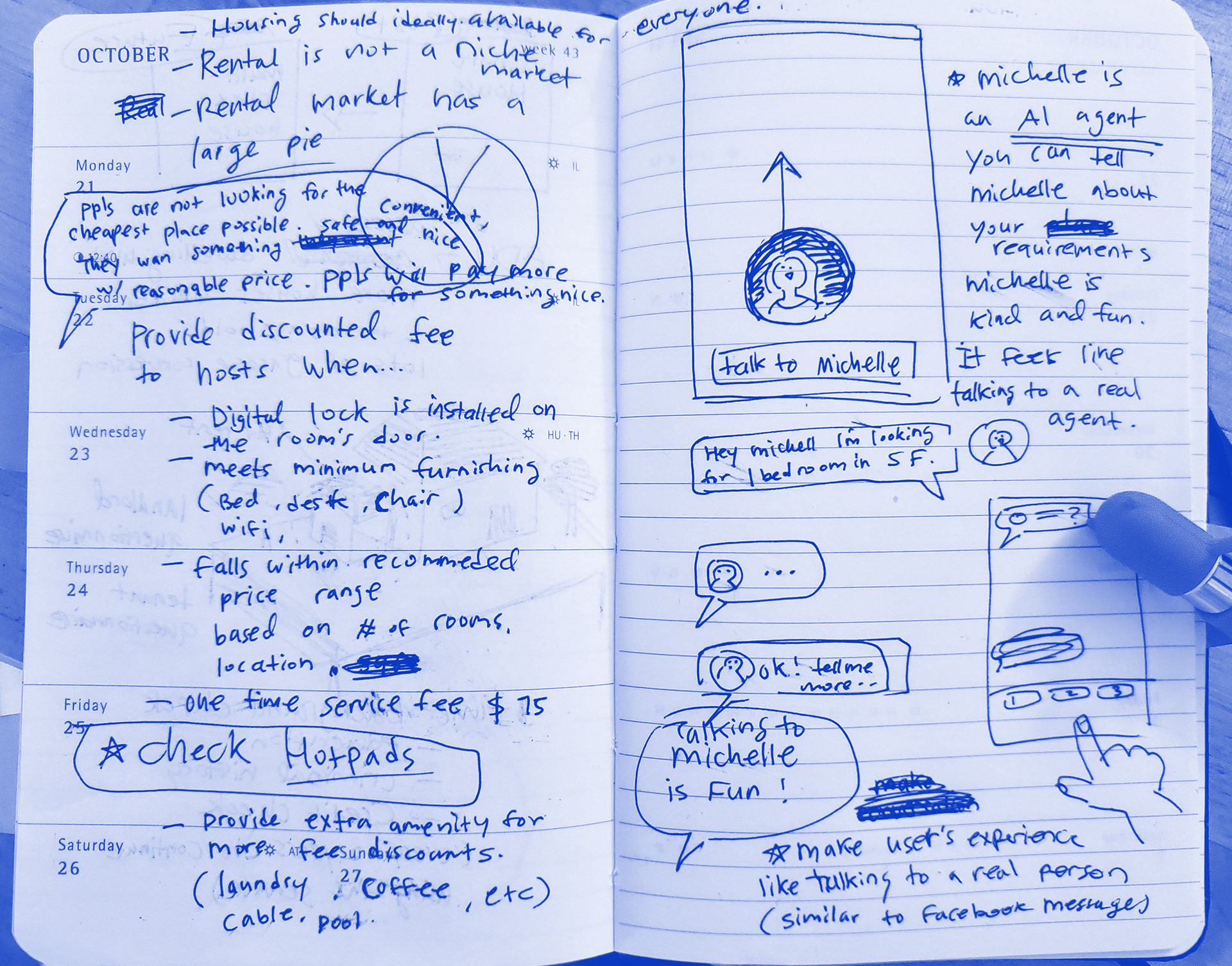
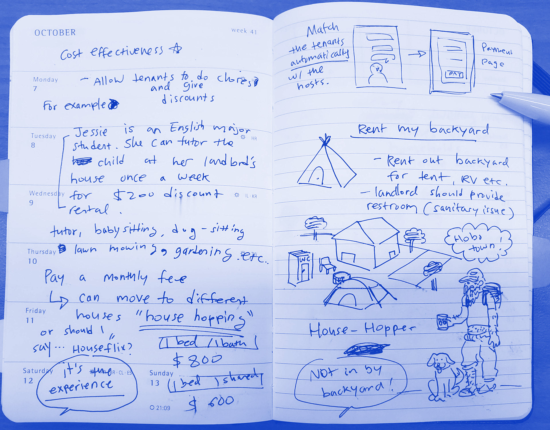
After I have completed my user research and created HMW statements, I started making notes of my ideas. I tried just to let my ideas run freely, even though some of them seemed unrealistic. Then I refined those free-flowing sketches and made deductive and analytical decisions. (I still liked my hobo town idea, but it had to go.) After reducing my ideas into a few solid ones, I moved on to the wireframes to create the MVP.
4. VALIDATION
I have conducted 3 rounds of usability testings to validate my solutions.
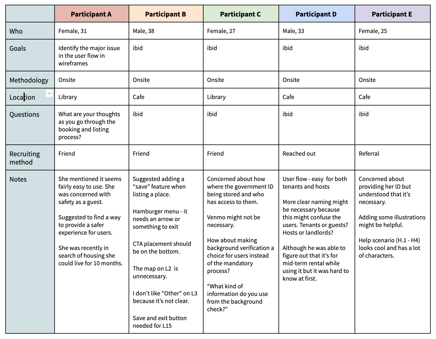
1. On-site guerilla testing with 5 participants using low-fidelity wireframes
2. First round of usability testing with 4 participants using the high-fidelity interactive prototype. There were three on-site moderated sessions and one remote moderated session.
3. Second round usability testing with 5 participants using the revised high-fidelity interactive prototype. I conducted three on-site moderated sessions and two remote moderated session this time.
Guerilla testing
Instead of giving the participants specific tasks to complete, I let them look through the screens and asked about their thoughts. No critical usability issues were found during this phase and the participants were able to understand the purpose of this app clearly.
I learned so much from this experience because the participants pointed out the problems with heuristics such as inconsistent CTA button placement and a few flow-blockers. One of the most interesting takeaways was the general concern about safety among female participants.
Usability testing - First round
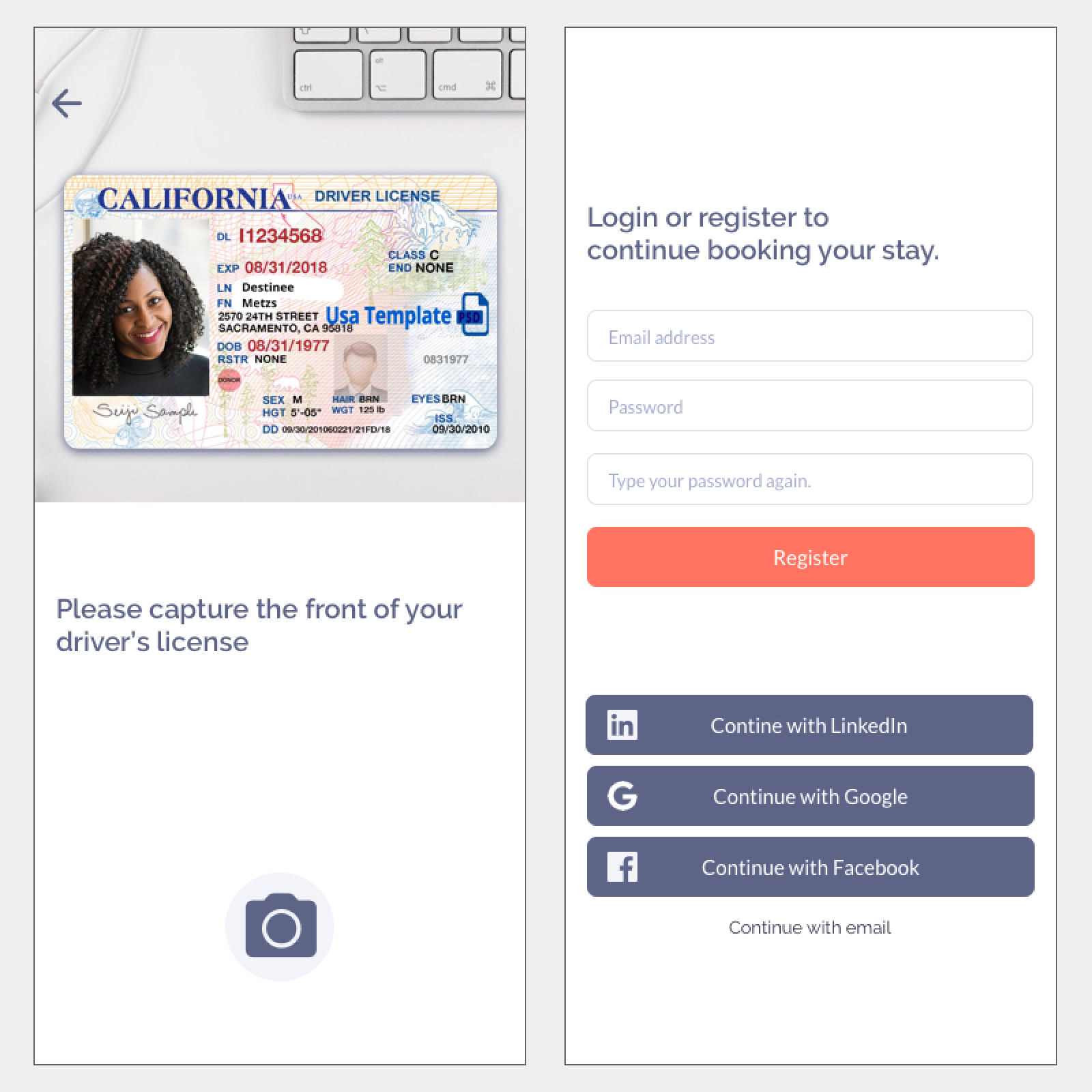
During the first round of usability testing with 4 participants, my main focus was to identify obvious usability issues with the prototype and hear the things my test participants wanted to share. The tasks given to the participants were the following.
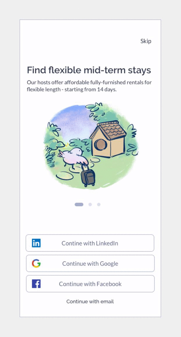
• Interact with the onboarding screen
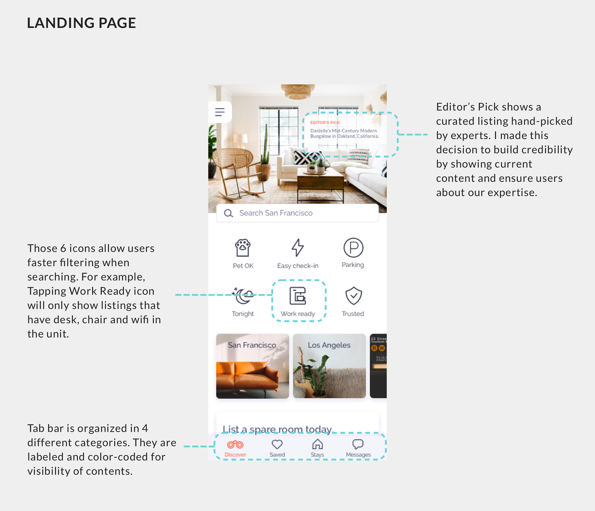
• Interact with Landing page
• Search for a room
• Book your room
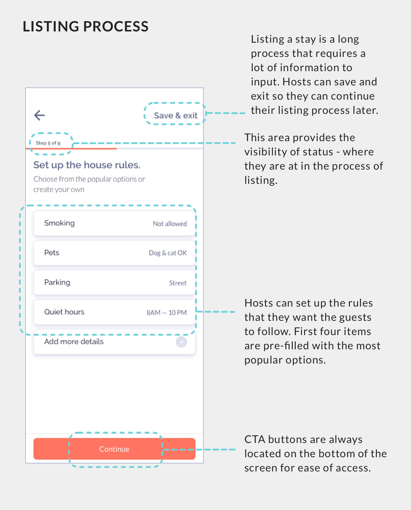
• List a place as a host
• Interact with the onboarding screen
• Interact with Landing page
• Search for a room
• Book your room
• List a place as a host
As expected, many usability issues were identified after the first round of usability testing.
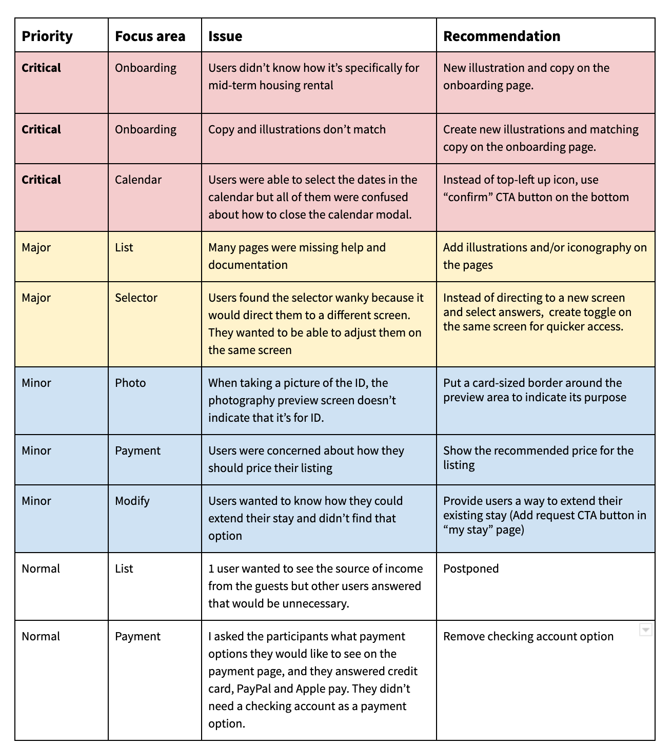
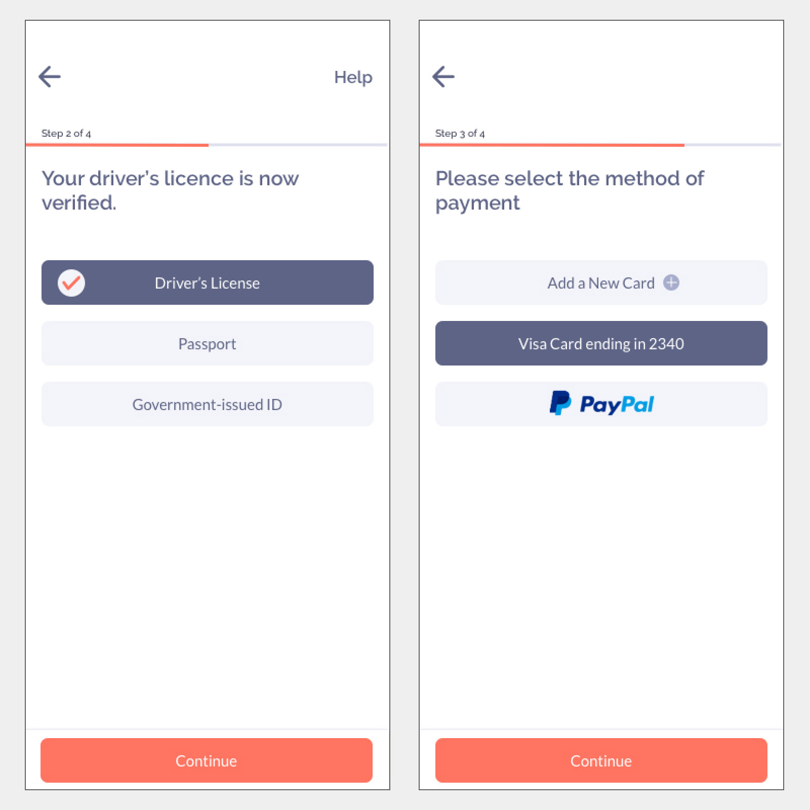
Usability testing - Second round
After I have identified the problems and possible solutions, I redesigned the prototype. Then again, I recruited 5 more people for the second round of usability testing to see if I have fixed the problems effectively.
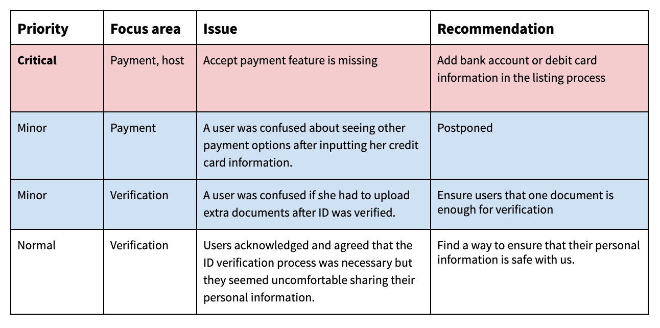
I noticed that many of the problems in the previous design were improved but new usability problems have emerged. One of them was a critical one - there was no way a host could accept the payment! I was surprised because until this moment, no one (including myself) have noticed the lack of the obvious receive payment feature for hosts. After all, I learned that this is why we do multiple usability testings.
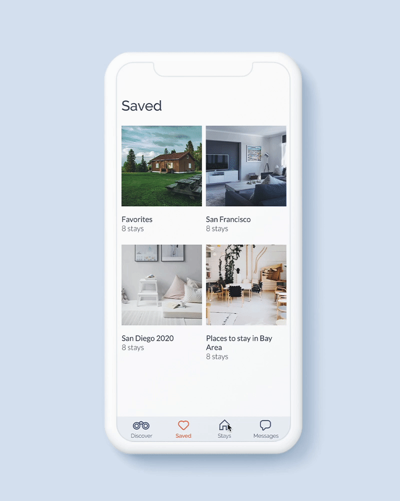
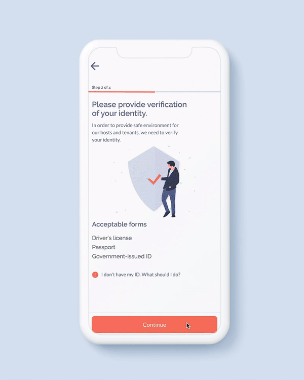
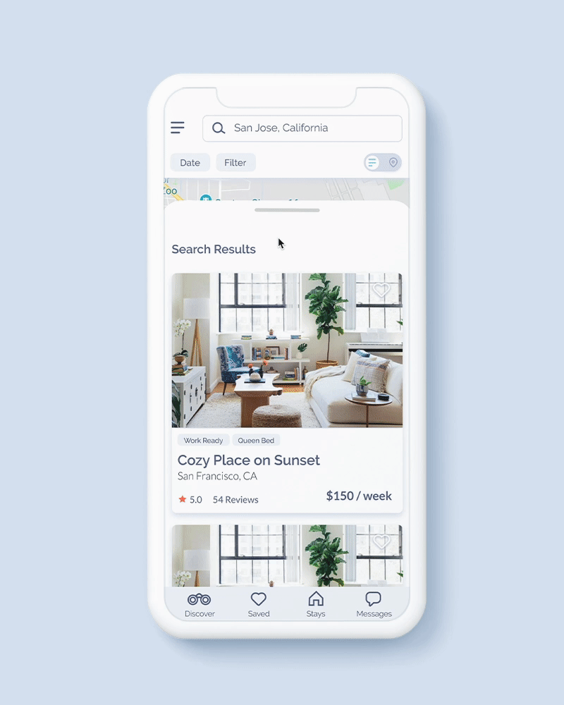
6. VISUAL DESIGN
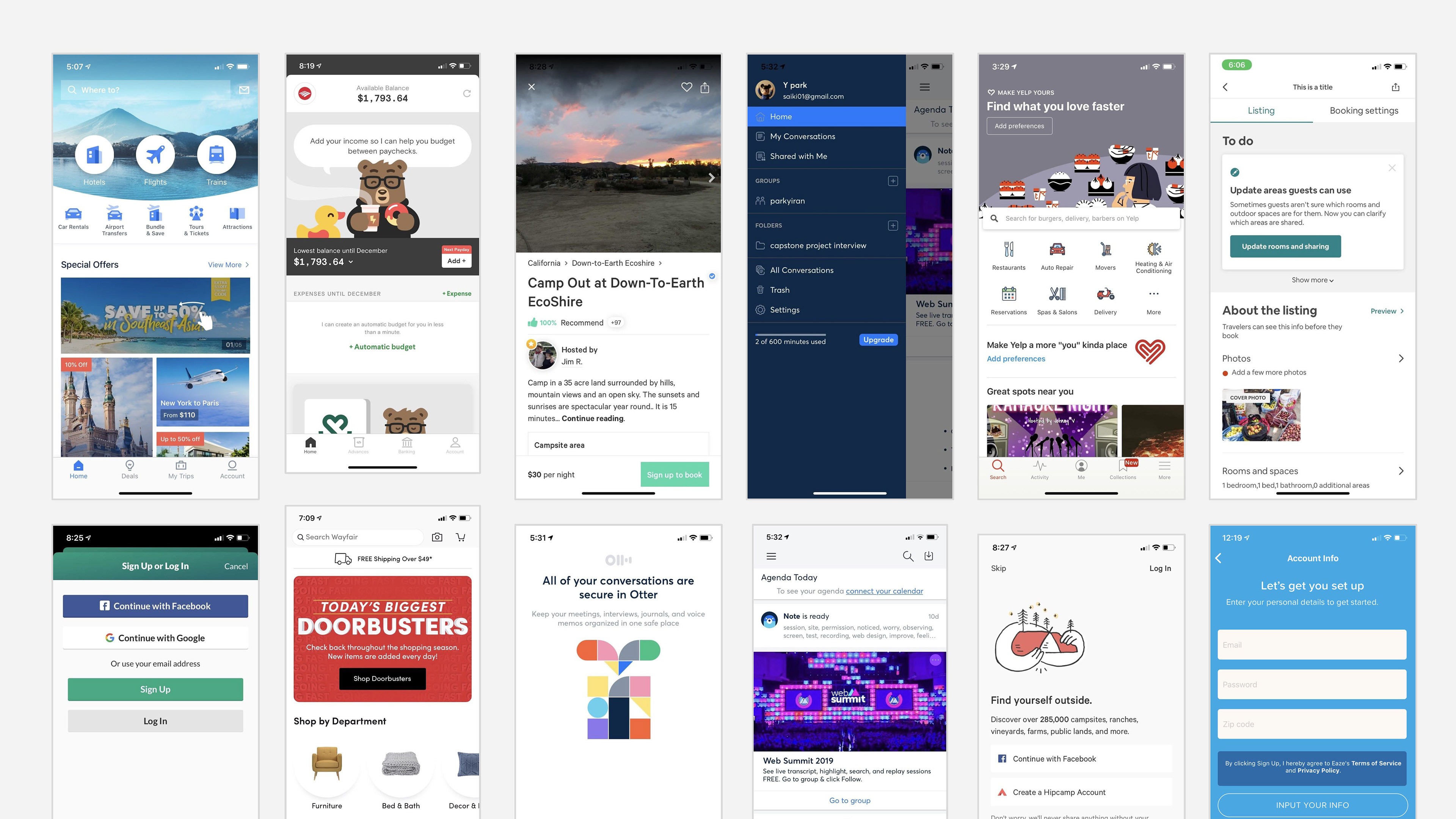
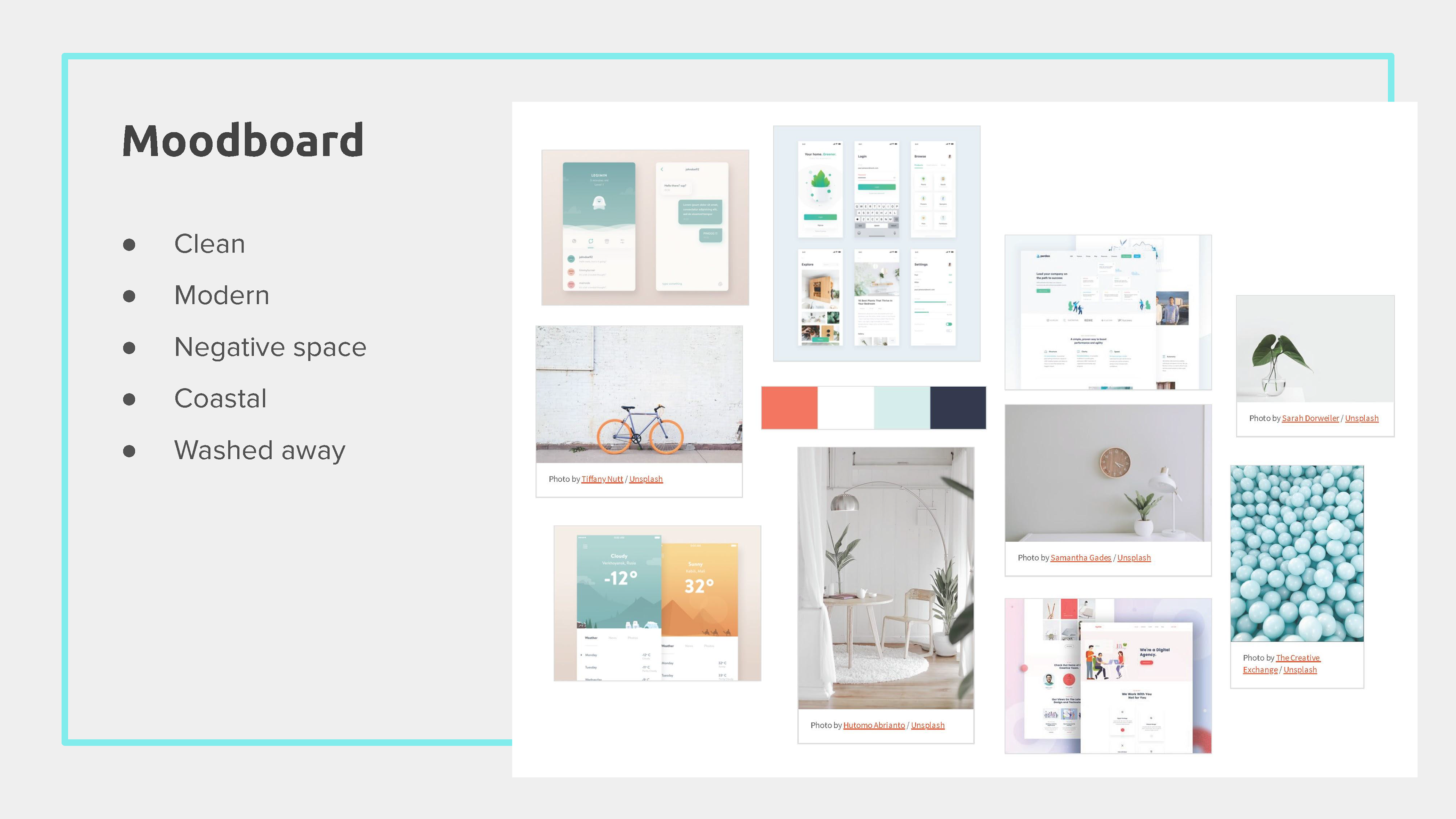
Design inspirations
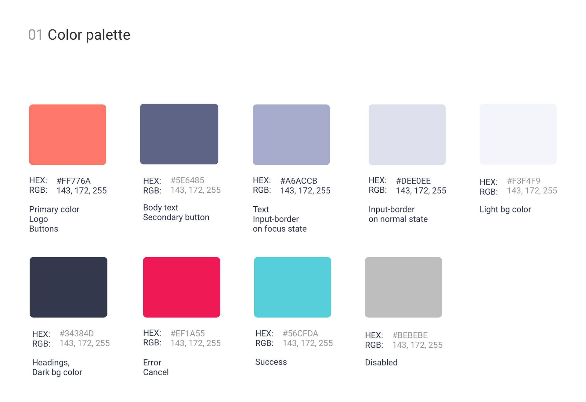
I studied the designs of other mobile apps on iOS and Android devices and applied my learnings to the hi-fi design. I concluded that going minimal and clean would be my best bet after analyzing the visual design of other mobile apps. I wanted to achieve a simple look for my visual design by using a lot of negative space and toned-down blue.
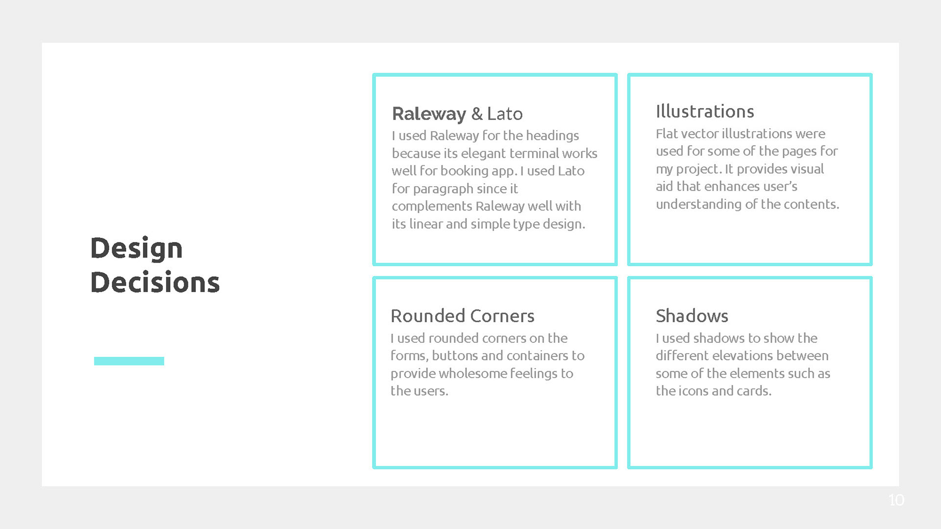
UI design
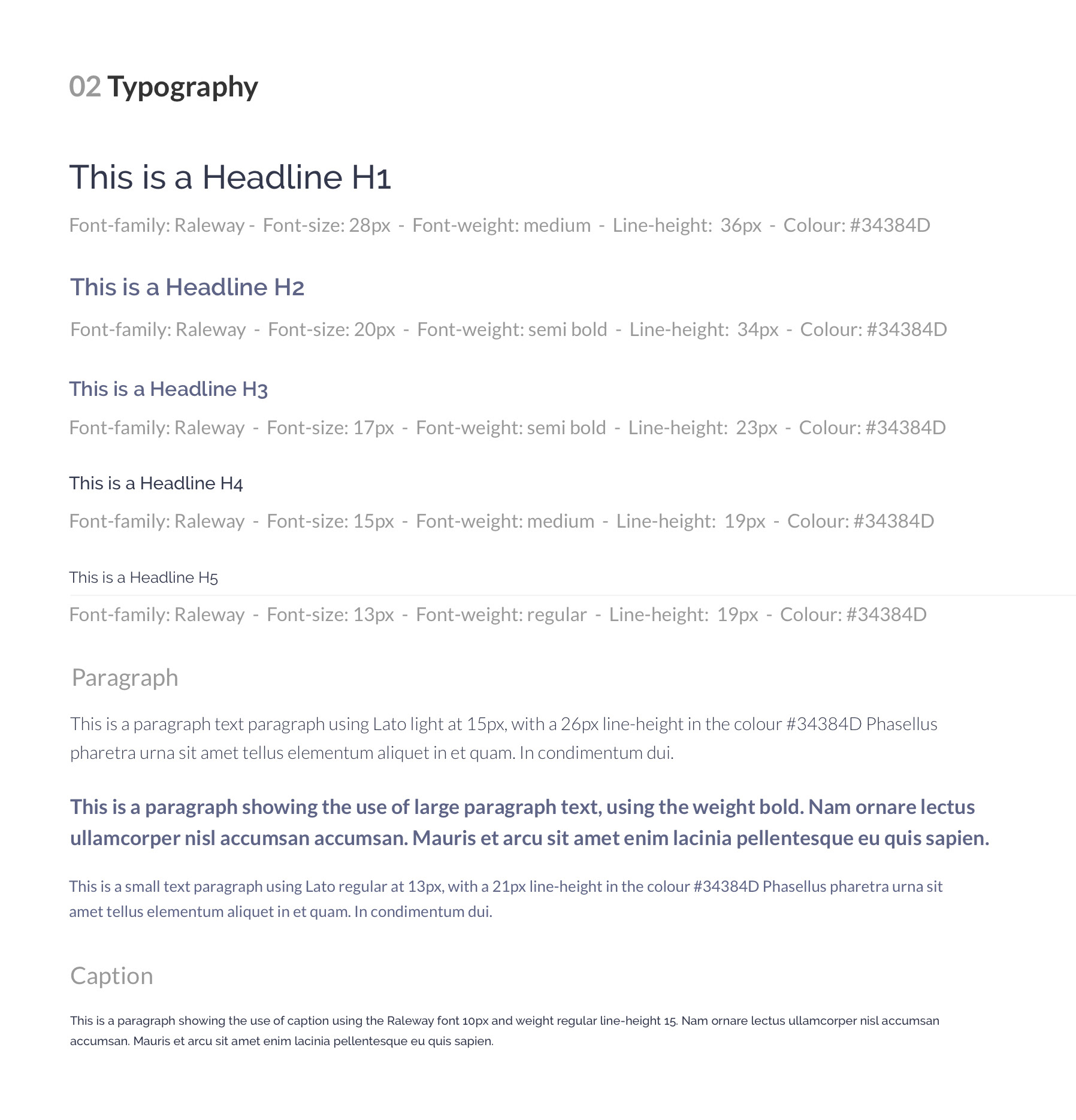
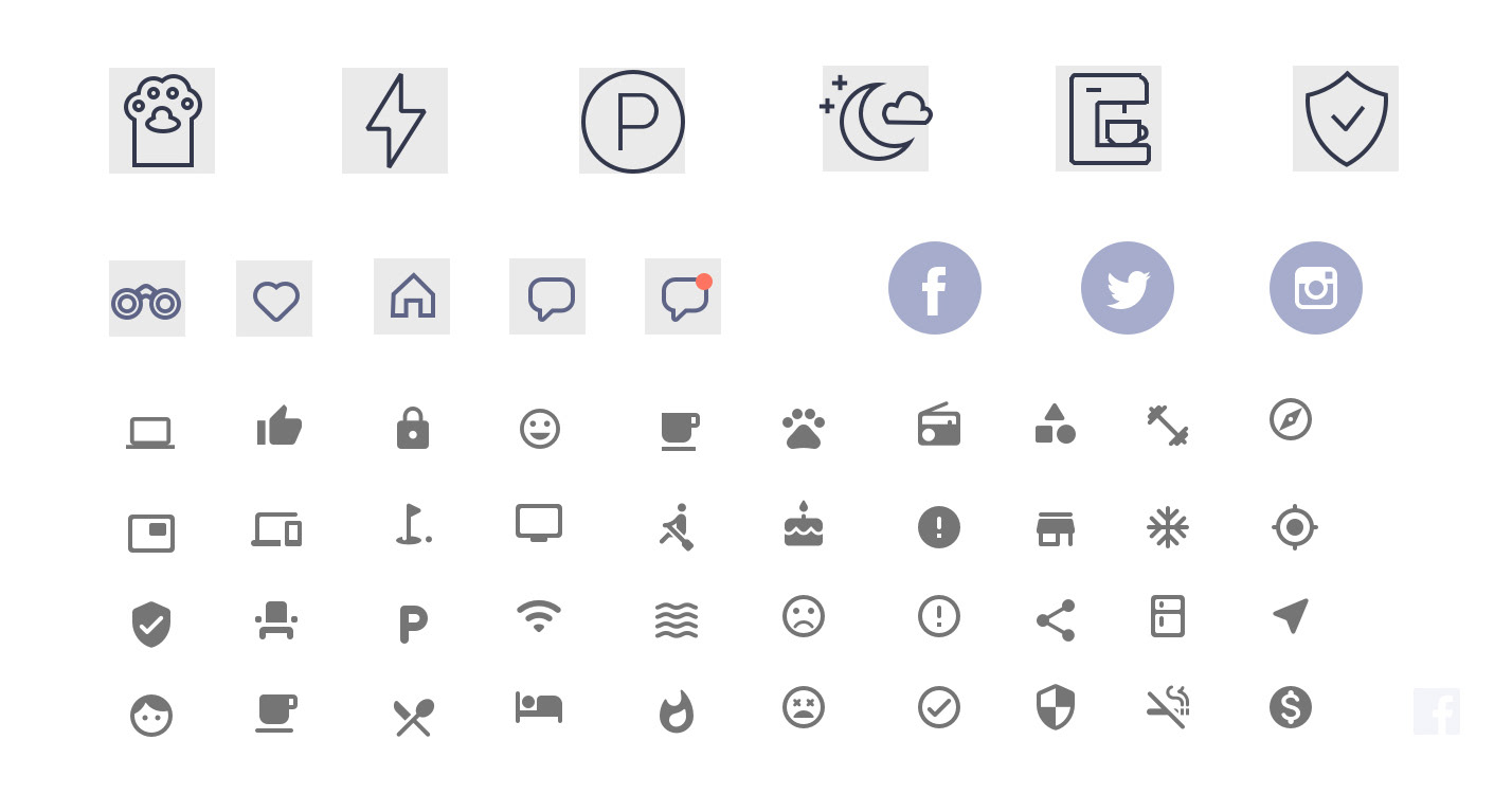
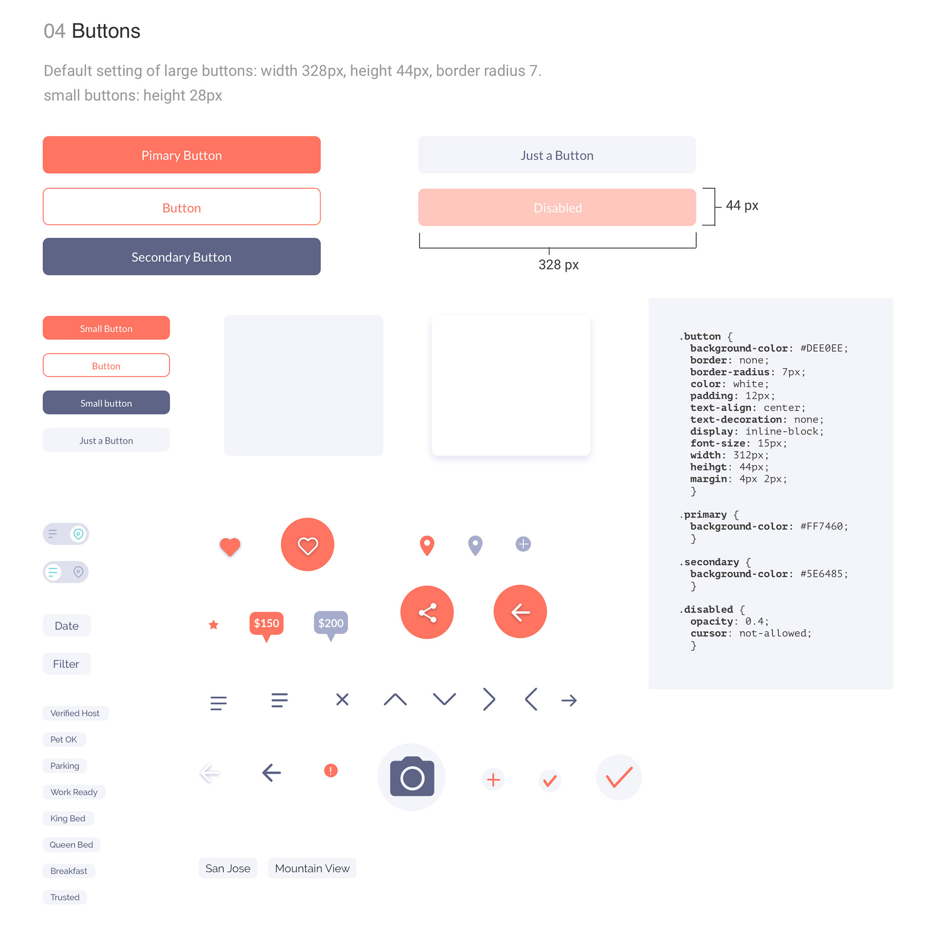
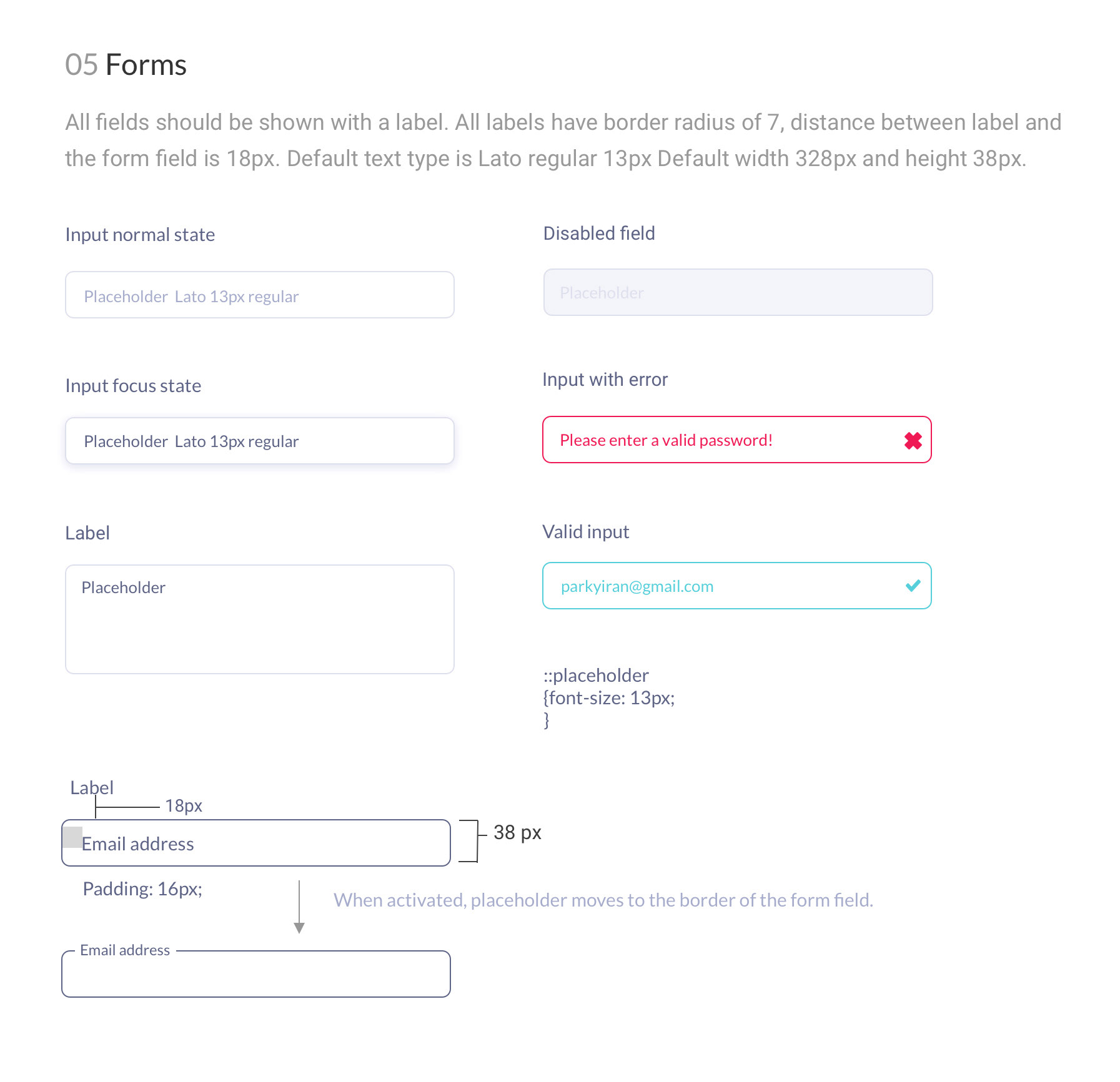
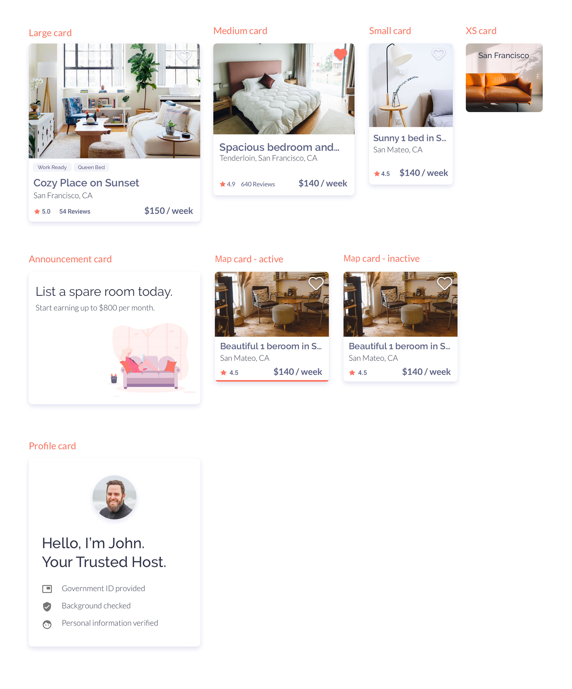
I have created the final hi-fidelity mockup and interactive prototype. I used the atomic design methodology to craft the interface design system.
MICRO-INTERACTIONS
Things I've learned
I've learned so much about UX research and design by doing this project. After the 3 months of intense coursework, I feel like I grew so much as a designer. However, I still think there's room for improvement in my research and design. Looking back at the project, there are things I might have approached differently.
• I could've made the design more inclusive
• I could research more about the hosts and learn from their perspective
Success
After the project was finished, I received a recommendation from my mentor:
"Yiran was a super mentee. I recommend her profile as a Junior UX Designer. During the course she did well all the exercises, she was very keen on details and always trying to improve her project. I really recommend watching her capstone project. The process and the understanding were good enough to say that Yiran has all the basic knowledge needed to be a UX Designer professional. The presentation of the final project is great because it shows the project in all the phases, from the research to the final prototype, which I think is the best way to present a UX work."
- Luca Longo, Senior UX designer at BookingSync.
Among the many things my mentor taught me, this is my favorite:
"Designers shouldn't compete; companies do, we don't. We need to cooperate and help out each other to make great designs."
Conclusion
Similar to Uber and Airbnb, my project is based on the idea of sharing economy. As people's definition of car ownership and vacation rental has changed, people's definition of homeownership is also changing as well. I have designed this app not only to address the issue, but also in the belief that people should be prepared for this social change. Home is no longer a permanent thing like it used to be. It's becoming something that can be shared with people, even with strangers. But is this a positive change? I'm not so sure. I think what it really indicates is the growing wealth inequality in our society. But let's save this conversation for another day.
Thanks for reading!